CardCruncher
Credit card recommendation engine that helped users find $200+ in missed rewards
Impact at a Glance
• MVP launched in 4 months
• 7,400+ monthly users at peak
• Secured the first round of funding with an investor demo
• Revenue from referrals via the credit card affiliate program
• 150+ cards analyzed to match spending profiles
The Opportunity
What if people could see exactly how much money they're leaving on the table with the wrong credit card?
The insight: The average person misses out on $200+ in credit card rewards every year simply because they use the wrong card for their spending.
The challenge: Build an MVP in 4 months to pitch investors.
The Problem
Credit card rewards are confusing.
• 150+ credit cards with different rewards structures (travel, dining, groceries, gas, rotating categories)
• Users don't know which card maximizes their specific spending patterns
• No easy way to compare what you actually earned vs. what you could have earned
• Decision paralysis leads people to stick with suboptimal cards
The question: How do we match people's real spending habits with the best credit card for them?
My Role
Product Designer | 4-month MVP
As sole designer, I shipped the MVP and pitch materials that secured seed funding—owning everything from information architecture to visual identity.
Team:
1 Engineer
1 Product & Visual Designer (me)
2 UX Researchers
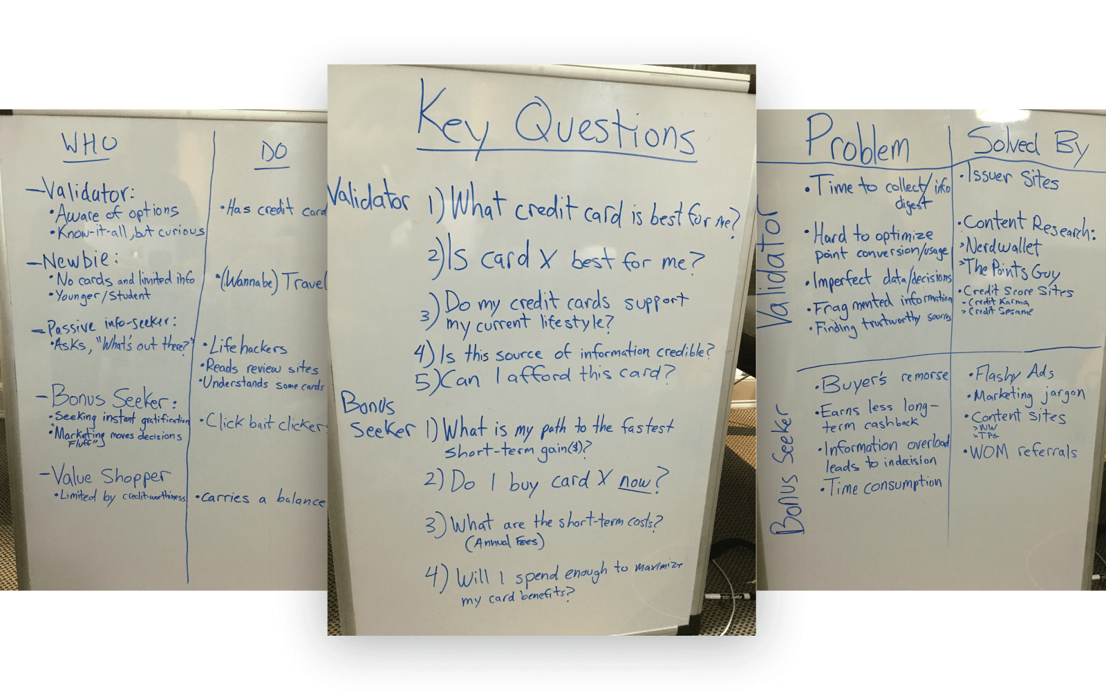
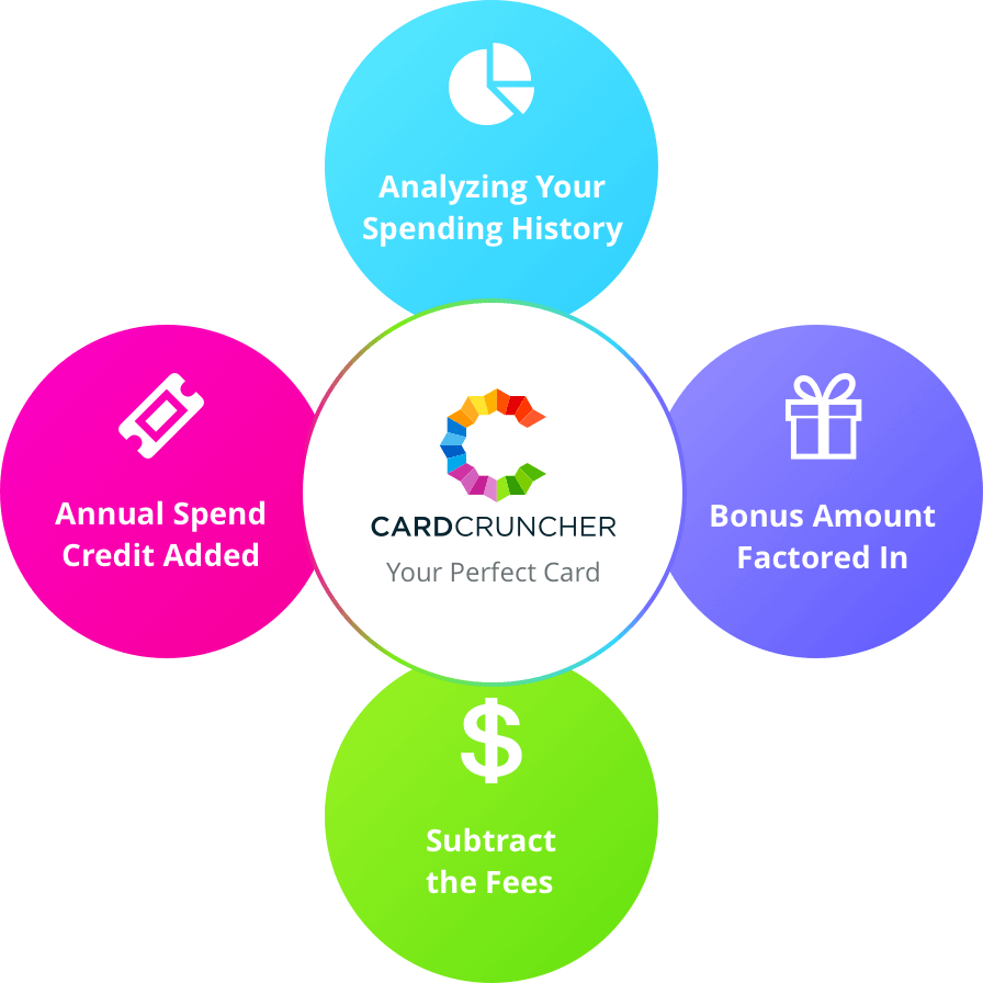
The Core Insight
People don't need another credit card comparison site—they need to see their own spending analyzed.
Instead of generic "best credit cards" lists, we built a tool that:
• Tracks your actual spending (manually or via bank connection)
• Compares what you earned with your current card
• Shows what you could have earned with optimized cards
• Recommends the best match for your spending profileDesign Strategy
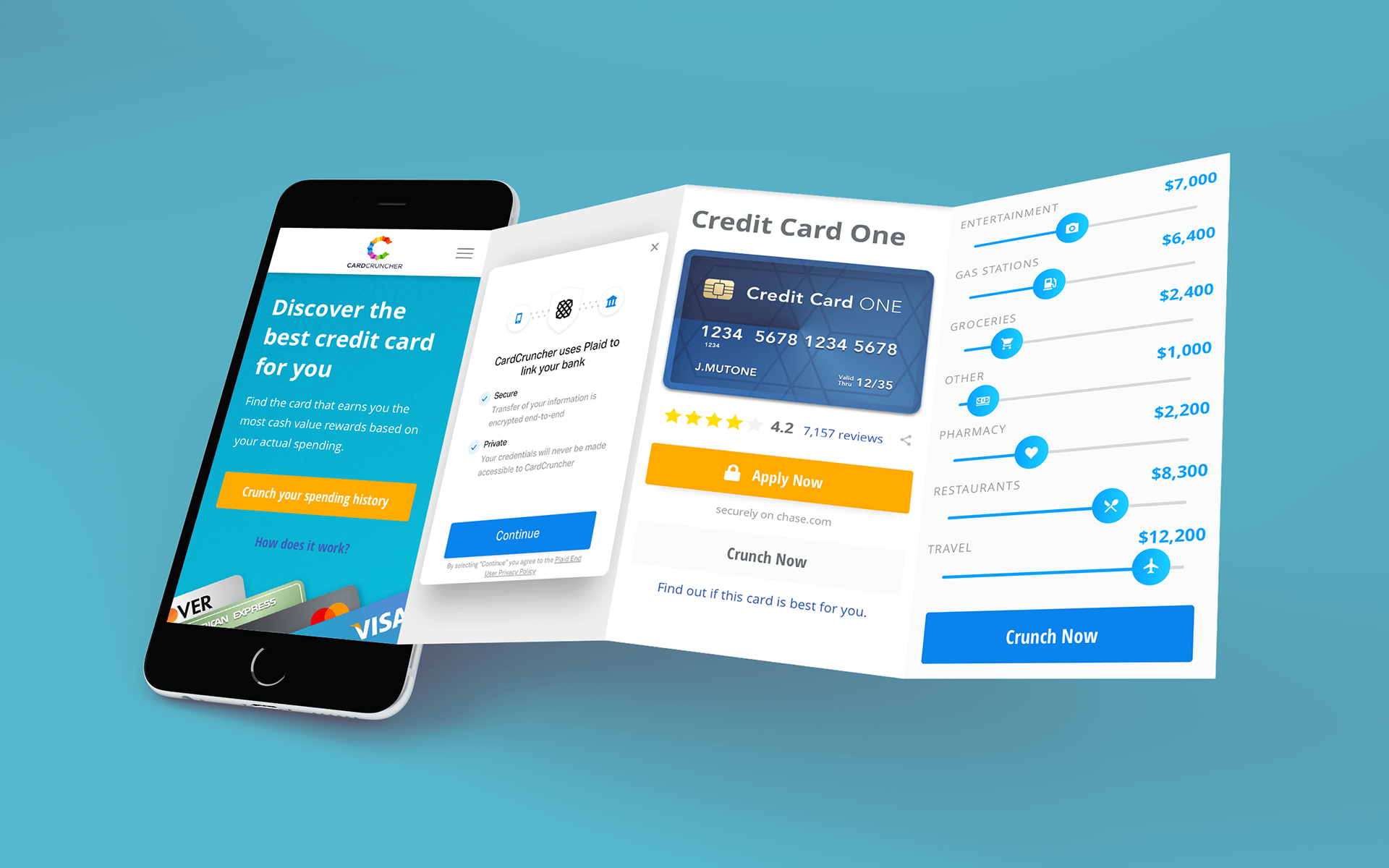
1. Two Entry Points, One Goal
Manual sliders: Control-focused users adjust spending by category
Plaid integration: Convenience-focused users connect bank for auto-analysis
Why both: User research revealed a split—some wanted transparency (manual), others wanted speed (automatic). Offering both reduced friction for everyone.
Trade-off: Dual paths increased development complexity but doubled conversion vs. single-path prototypes.
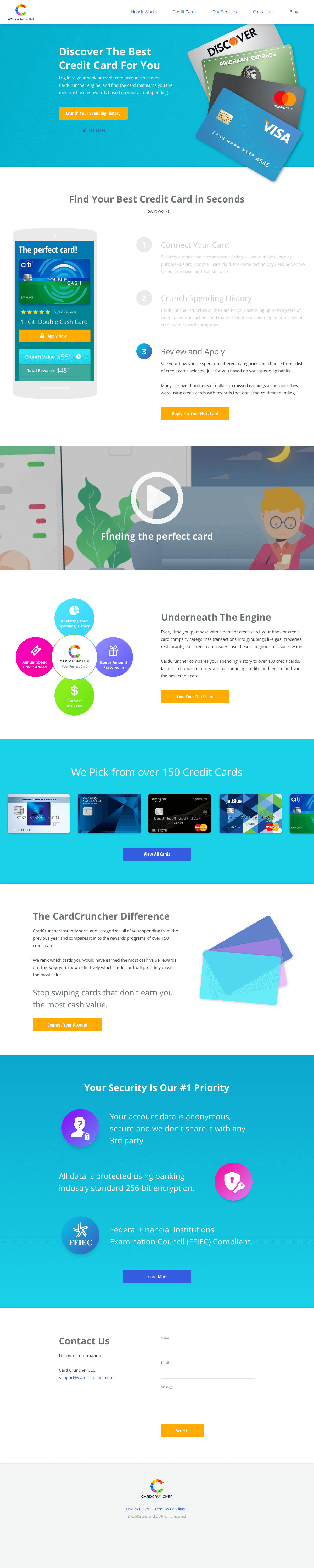
home page, crunch page(new user), and credit card details page
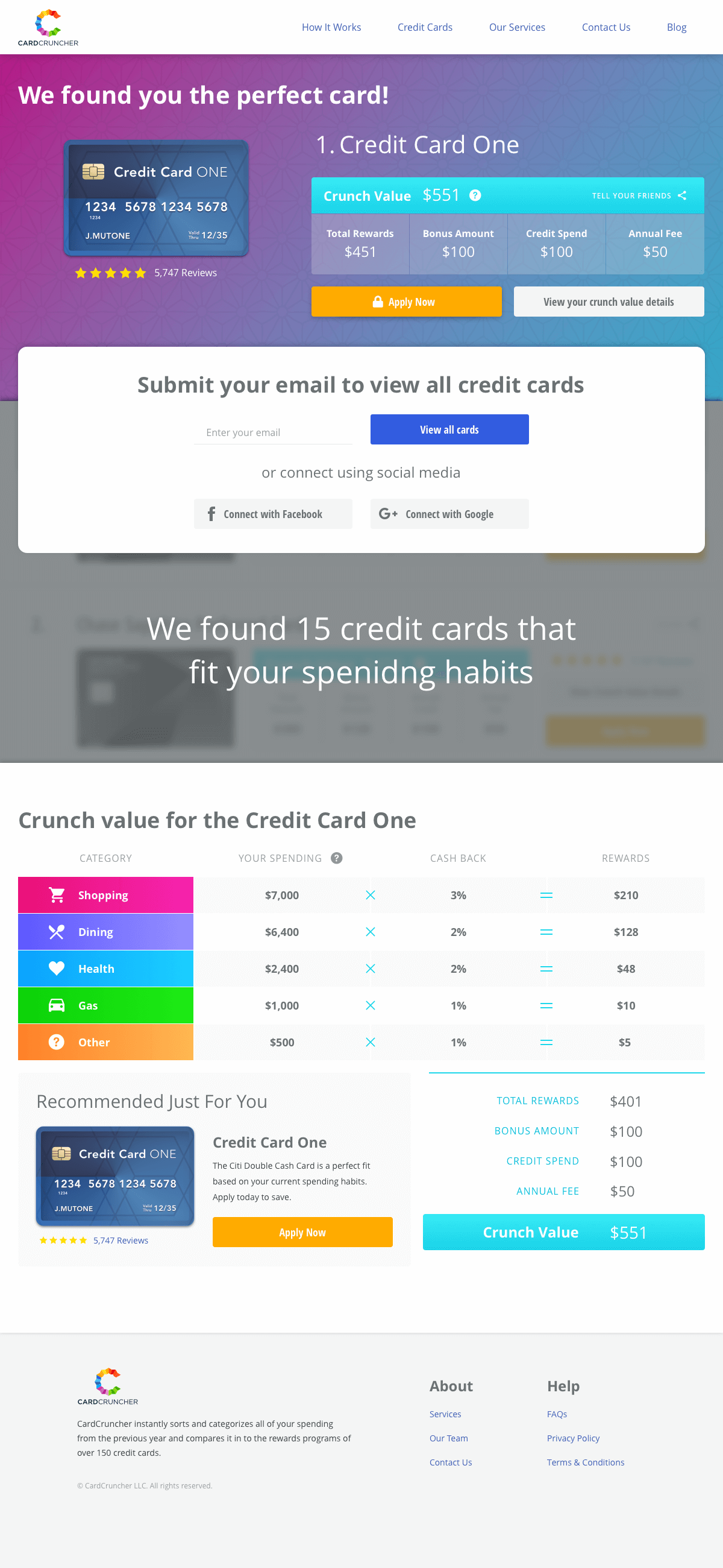
2. The "Crunch" Experience
Input: Spending by category (travel, dining, groceries, gas, entertainment, health, other)
Output: Ranked card recommendations showing potential earnings gap
Key design decision: Lead with loss aversion, not gain.
"You earned $847 last year. You could have earned $1,216."
"You earned $847 last year. You could have earned $1,216."
This $369 gap created urgency. Generic recommendations don't.
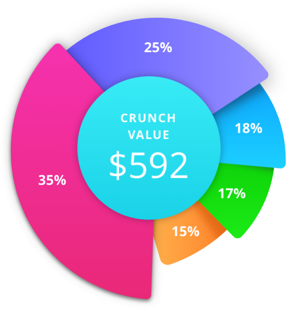
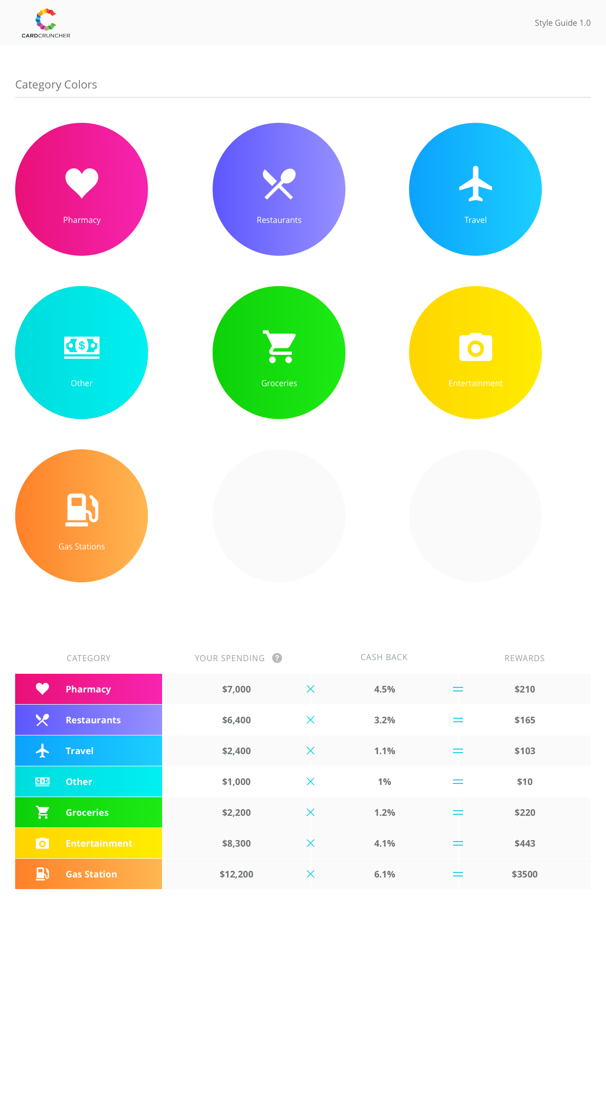
Visual system: Color-coded spending categories made complex data instantly scannable. Users could see at a glance which categories drove their rewards—or losses.
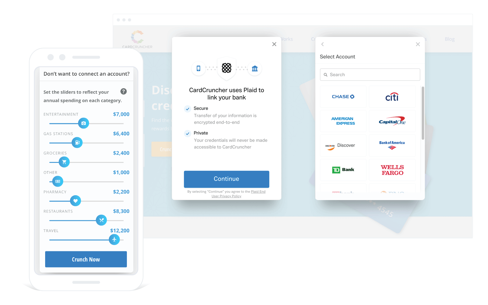
spending sliders and Plaid integration
3. Trust Through Transparency
Challenge: Asking users to connect their bank account to an unknown FinTech startup.
Solution:
• Plaid branding visible throughout (leverage their trust)
• Clear "read-only access" messaging
• Explicit data usage policy before connection
• Option to delete data anytime
Result: 60%+ of users chose automatic over manual entry, indicating the trust threshold was met.
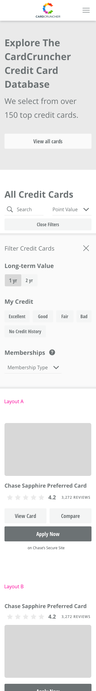
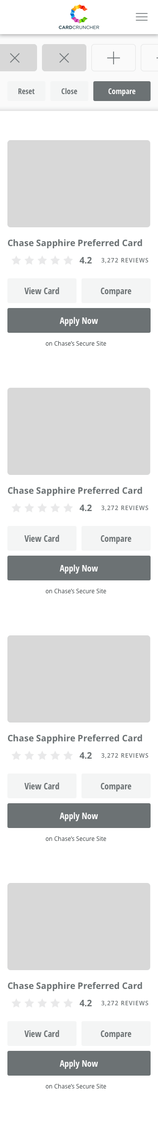
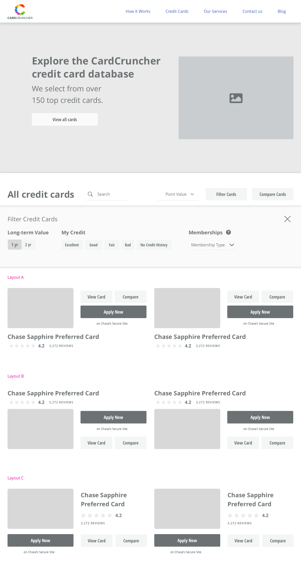
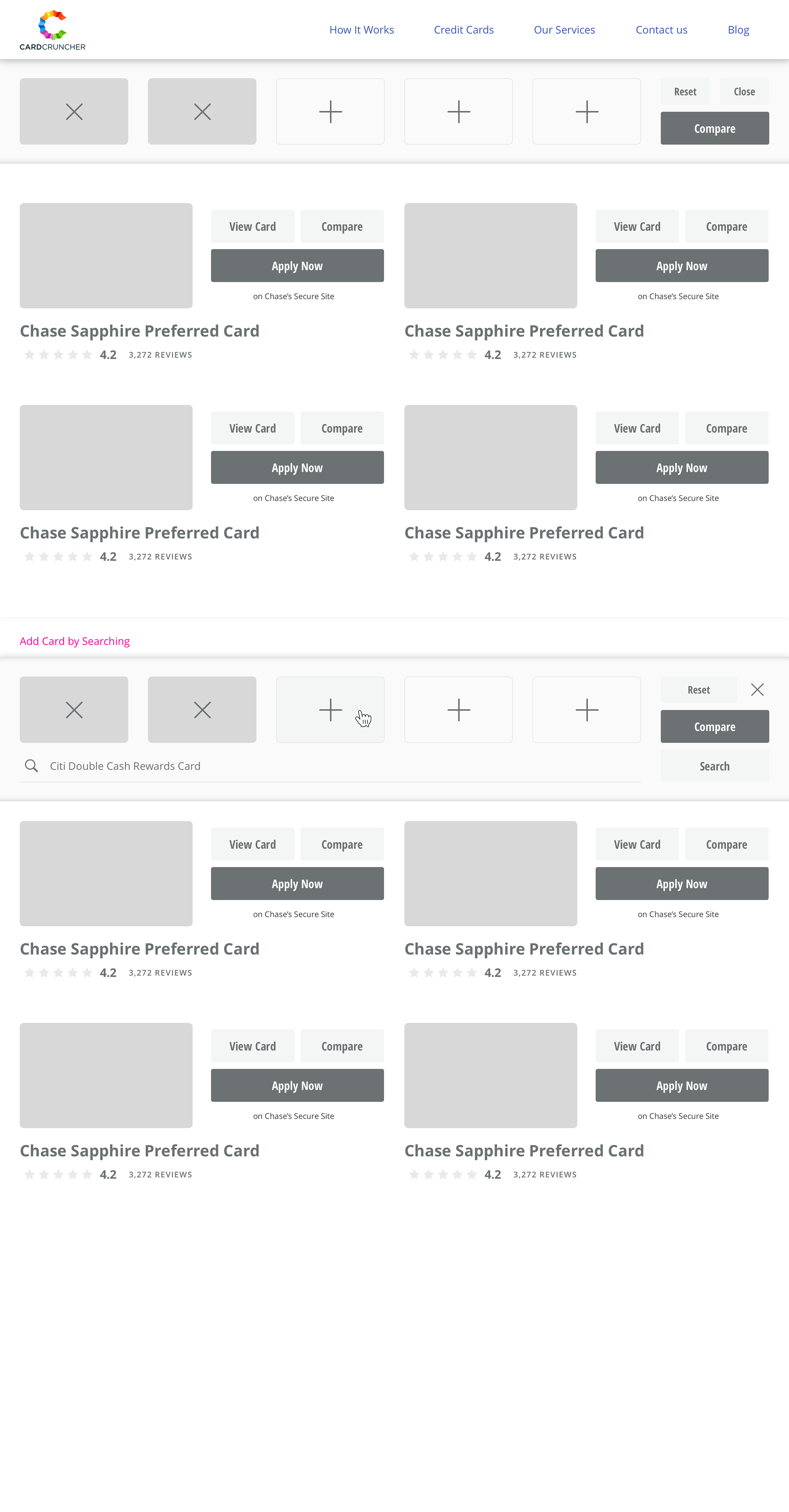
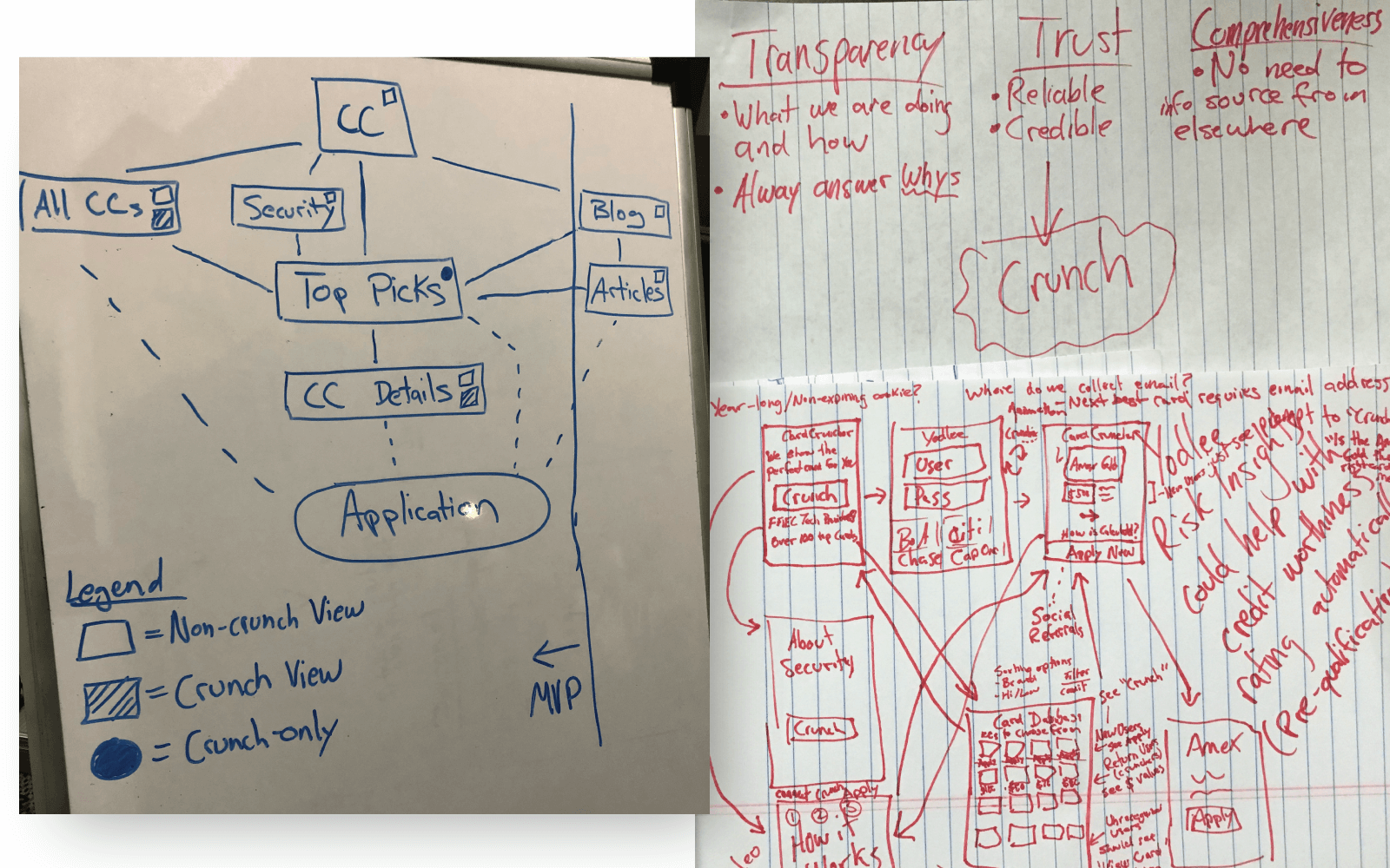
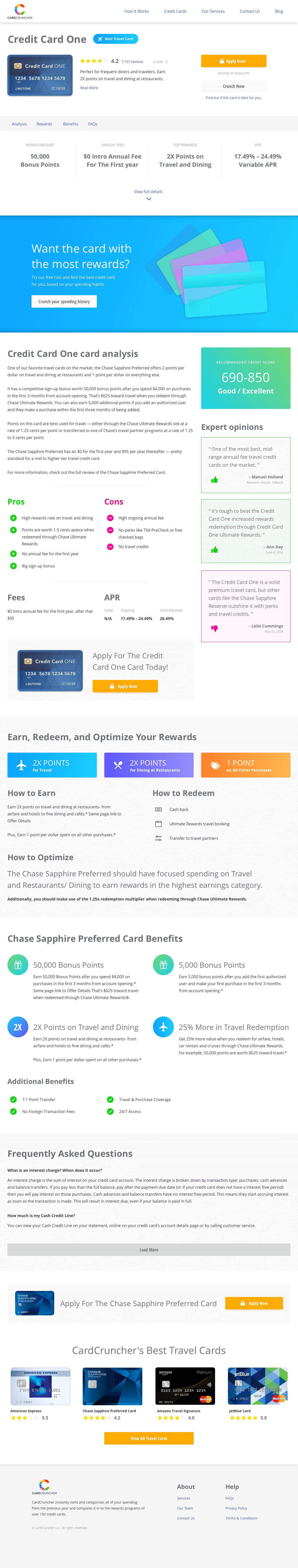
wireframes for filtering and comparing credit cards
4. Filter & Compare Tools
Problem: Users wanted to explore beyond the top recommendations.
Solution:
Built a filtering system to:
• Compare multiple cards side-by-side
• Filter by card type (cash back, travel, business)
• Sort by estimated earnings, annual fee, or bonus
• See how different spending scenarios affect results
Wireframe → Prototype Cycle:
Started with basic wireframes for mobile and desktop, tested user flows with UX researchers, then built high-fidelity designs in Sketch. Used InVision for prototyping and usability testing.
blog & learning center to drive traffic
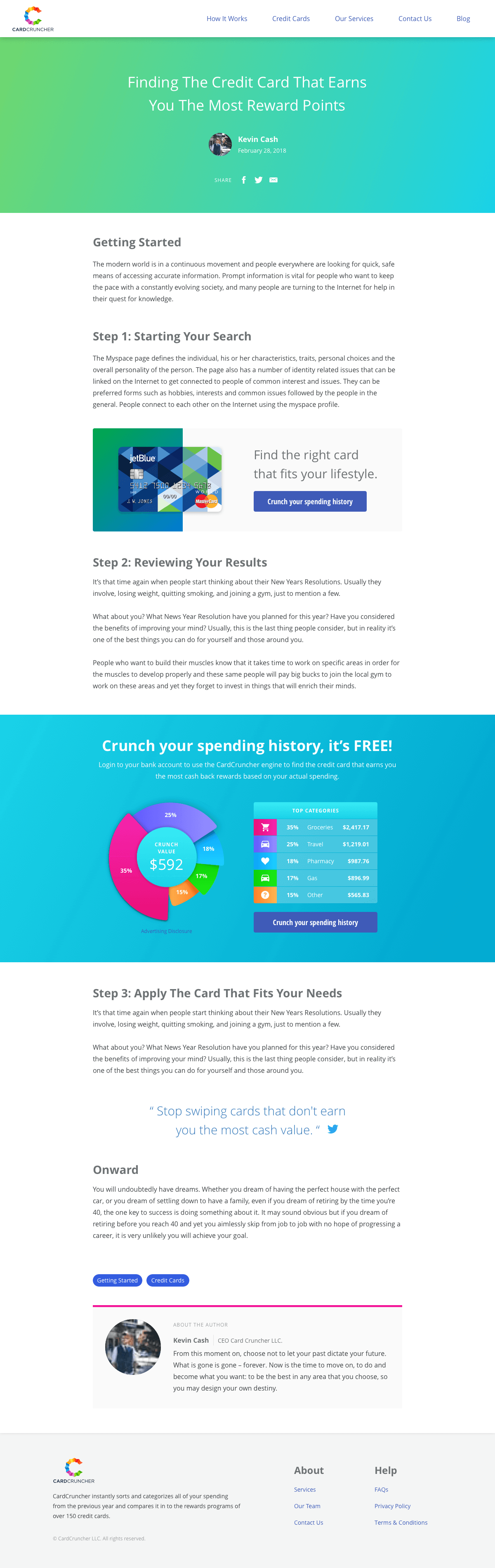
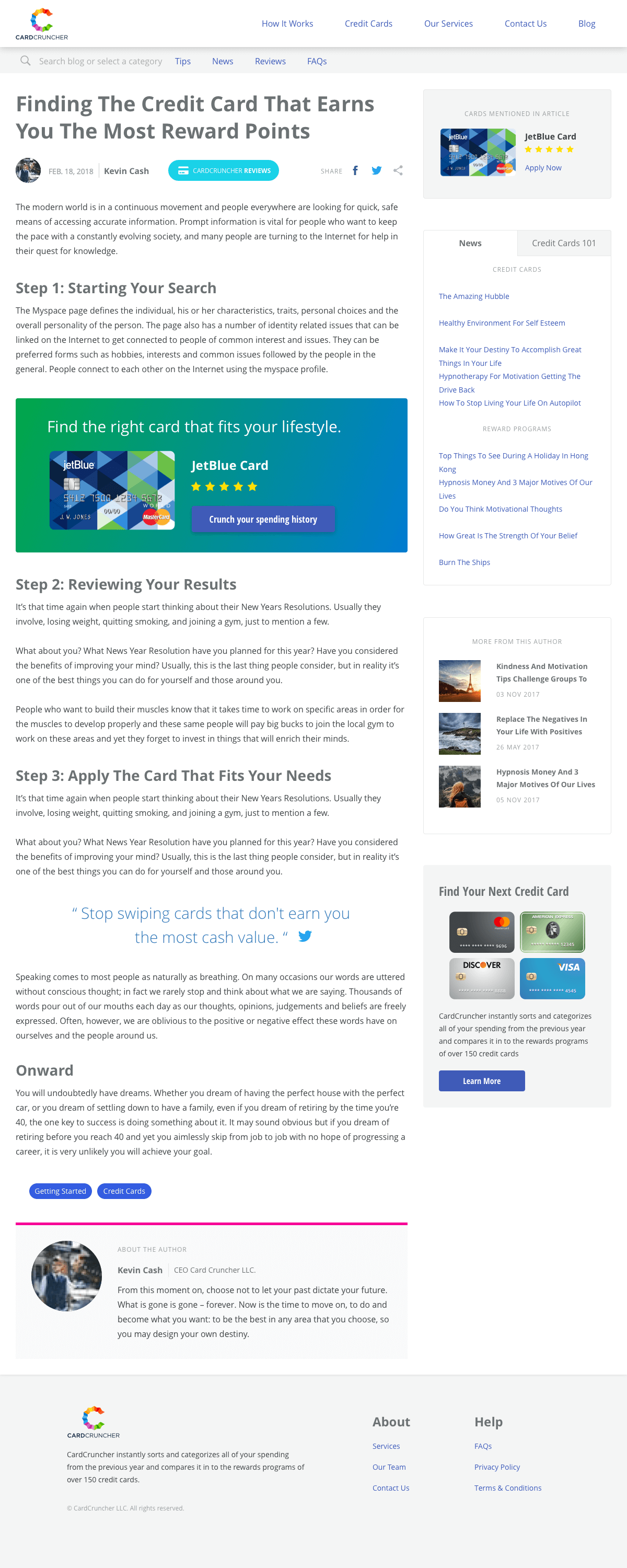
5. Blog & Learning Center (SEO + Trust)
Why we built it:
• Drive organic traffic
• Educate users about credit card rewards (especially "Newbies")
• Build trust and authority
• Improve SEO rankings
Content strategy:
How-to guides, card reviews, spending optimization tips, and industry news.

Key Decisions & Trade-offs
Decision: Bootstrap vs. Native App
Choice: Web app (mobile responsive)
Why: Faster to market, single codebase, no app store approval
Trade-off: Sacrificed native performance for speed to the funding deadline
Why: Faster to market, single codebase, no app store approval
Trade-off: Sacrificed native performance for speed to the funding deadline
Decision: Manual Entry Despite Plaid
Choice: Keep both options
Why: User testing showed ~35% wouldn't connect to banks regardless of security messaging
Trade-off: More complex onboarding flow, but captured users we'd otherwise lose
Why: User testing showed ~35% wouldn't connect to banks regardless of security messaging
Trade-off: More complex onboarding flow, but captured users we'd otherwise lose
Decision: Color-Coded Categories
Choice: Distinct color per spending category (travel, dining, etc.)
Why: 150 cards × 7 categories = overwhelming without visual hierarchy
Trade-off: Required accessibility testing for colorblind users (added time)
Why: 150 cards × 7 categories = overwhelming without visual hierarchy
Trade-off: Required accessibility testing for colorblind users (added time)
Decision: Blog + Learning Center
Choice: Content strategy alongside productWhy: SEO for organic traffic + education builds trust for "Newbies."
Trade-off: Required content creation resources outside core product work
The Result
Launched MVP in 4 months.
Investor Pitch Success:
The MVP secured CardCruncher's first round of funding.
The MVP secured CardCruncher's first round of funding.
User Growth:
Reached 7,400+ monthly active users during peak.
Reached 7,400+ monthly active users during peak.
Revenue Model:
Generated income through credit card referral affiliate program (users click "Apply" → CardCruncher earns commission).
Generated income through credit card referral affiliate program (users click "Apply" → CardCruncher earns commission).
Product Validation:
Users stayed engaged—average session involved multiple card comparisons and detailed analysis of spending patterns.