DraftStreet Mobile App
Mobile-first redesign that helped position a fantasy sports startup for acquisition by DraftKings
Impact at a Glance
• Acquired by DraftKings in 2014
• 40% increase in sign-up conversions with redesigned onboarding flow
• 500,000+ daily users at peak
• 10-month timeline from concept to MVP
• Mobile-first strategy adopted by the C-suite after presenting user data
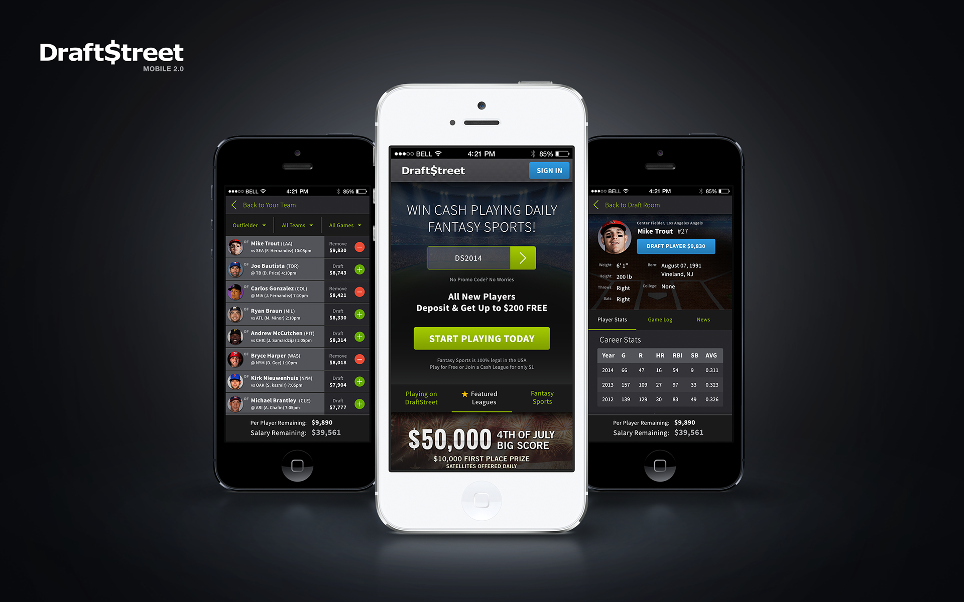
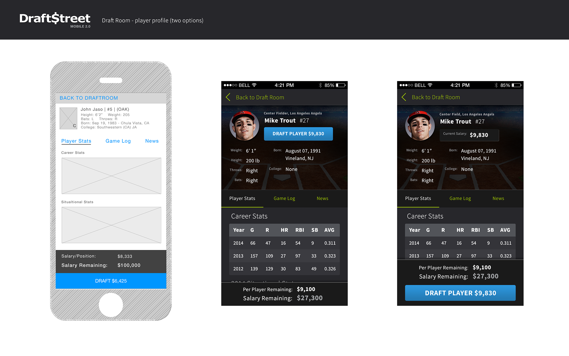
draftroom, first-time landing page, and player detail mobile screens
The Company
DraftStreet launched in 2010 as a daily fantasy sports platform offering cash prizes. By 2014, it had become one of the top three fantasy sports apps, competing directly with DraftKings and FanDuel.
The problem: DraftStreet was built for desktop. Mobile was an afterthought.
The reality: Users were shifting to mobile devices—and DraftStreet was losing them.
My Role
Lead Product Designer & Creative Director
10 months | Employee #15
I joined DraftStreet as their first in-house designer to lead product design and marketing creative. After identifying critical gaps in the team structure, I successfully advocated for hiring:
• 1 Visual Designer (to handle marketing, freeing me to focus on product)
• 1 Product Manager
• 1 Full-time Front-End Engineer
This new team was essential for building the mobile-first app while maintaining the existing desktop product.
DraftStreet mobile app
The Problem
DraftStreet's mobile experience was broken
After auditing the entire product, I found:
• Fragmented experience: Mobile UI varied by device and browser
• No responsive design: Desktop-first approach with mobile bolted on
• Inconsistent UI: No CSS framework, multiple conflicting stylesheets
• Poor performance: Slow load times, broken interactions
• Dated interface: Confusing UX that drove users to competitors
The competitive threat:
DraftKings and FanDuel both had polished native mobile apps. DraftStreet had a barely functional mobile web experience.
DraftKings and FanDuel both had polished native mobile apps. DraftStreet had a barely functional mobile web experience.
The deadline:
Launch a responsive mobile app by NFL kickoff in September—the highest-traffic season for fantasy sports.
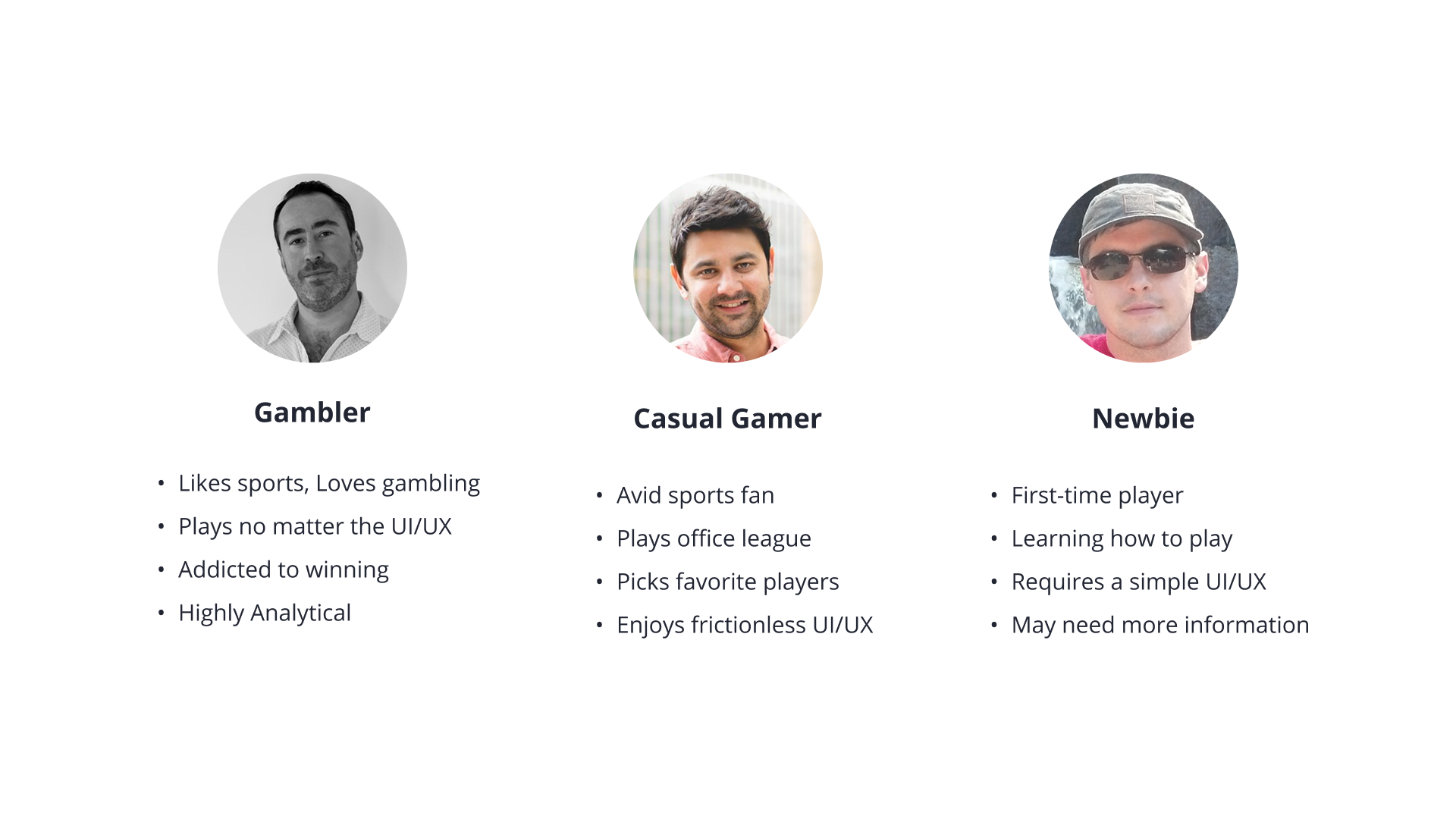
Research: Understanding Three User Types
I interviewed 10+ team members, top affiliates, and dozens of users to identify three distinct personas:
The Gambler (Most valuable)
Loves sports but lives to gamble. Highly analytical, possibly borderline addicted. Will play regardless of UI quality—as long as they can win money.
Loves sports but lives to gamble. Highly analytical, possibly borderline addicted. Will play regardless of UI quality—as long as they can win money.
The Casual Gamer (Most common)
Plays in office leagues, picks favorite players. Needs frictionless UX to stay engaged. If the experience is cumbersome, they won't return.
Plays in office leagues, picks favorite players. Needs frictionless UX to stay engaged. If the experience is cumbersome, they won't return.
The Newbie (Growth opportunity)
First-time player. Knows sports but is unfamiliar with fantasy formats. Requires a simple UI and clear instructions; otherwise, they'll bounce immediately.
First-time player. Knows sports but is unfamiliar with fantasy formats. Requires a simple UI and clear instructions; otherwise, they'll bounce immediately.
Key Insight:
The Gambler will tolerate bad UX. The Casual Gamer and Newbie won't. To grow, we needed to design for the least experienced users.
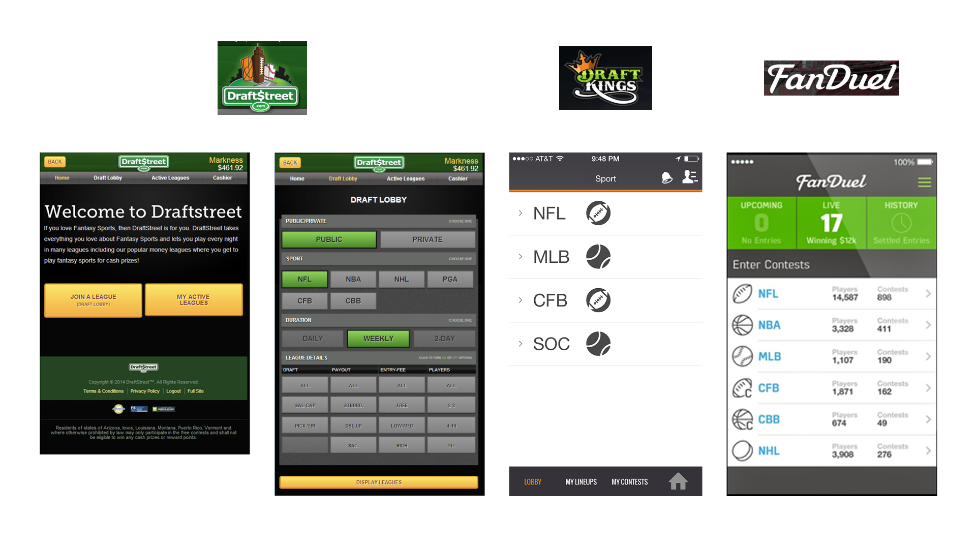
DraftStreet, DraftKings, Fanduel mobile lobby comparison
The Strategy: Mobile-First
The hardest sell I made at DraftStreet was convincing the C-suite to go mobile-first.
Desktop revenue was strong. The team was comfortable. Shifting to mobile felt risky.
My case:
• Presented data showing a clear user shift from desktop to mobile
• The emphasized trend would only accelerate as smartphones became more accessible
• Argued that mobile-first forces feature prioritization, leading to faster development
• Brought in Bloomberg Business magazine featuring Facebook's story—how delaying mobile development by 2 years cost them significantly
Result: C-suite approved mobile-first strategy.
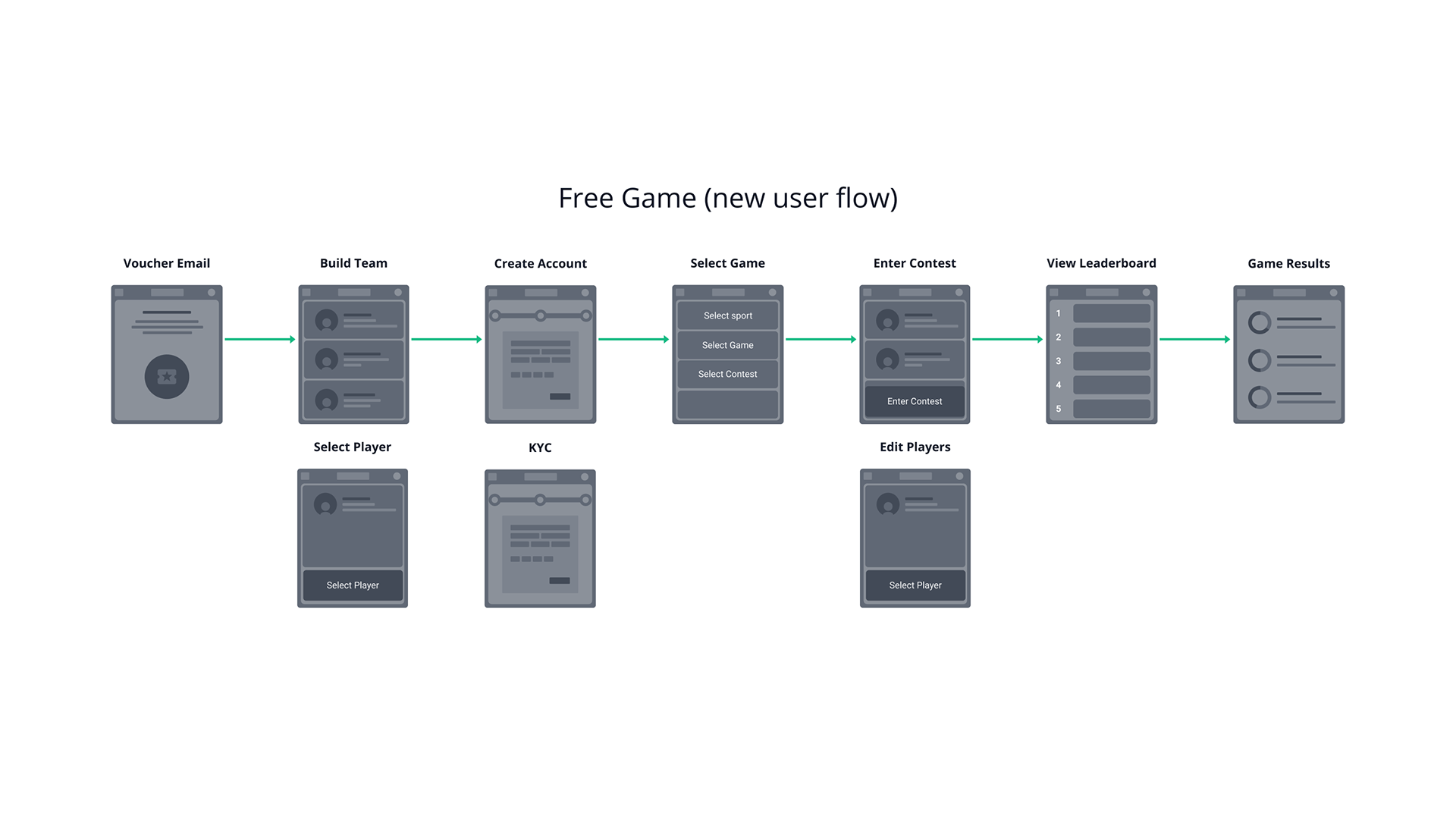
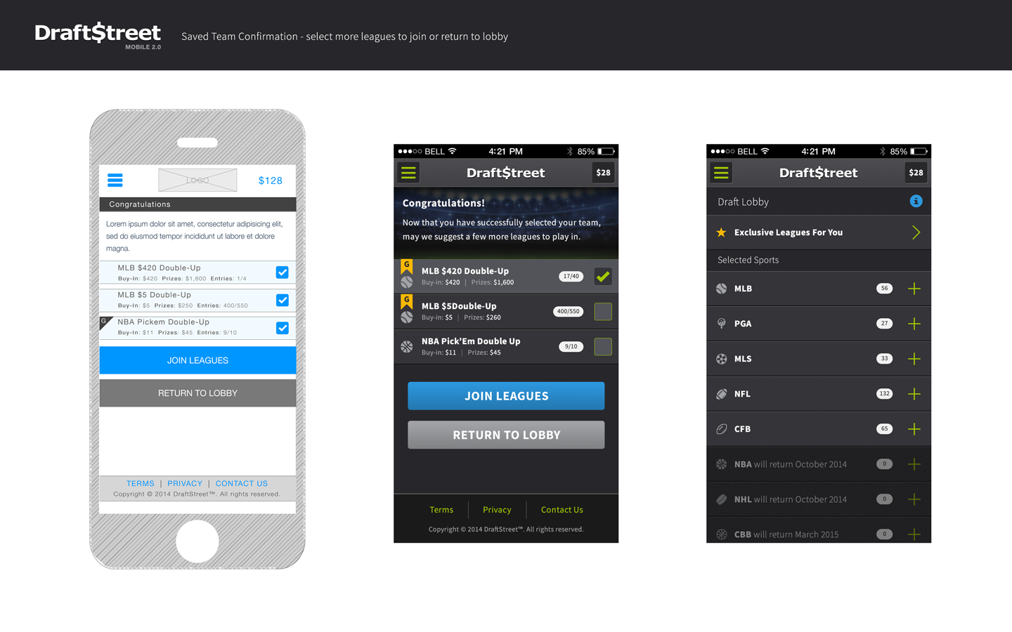
new user "Free Game" flow
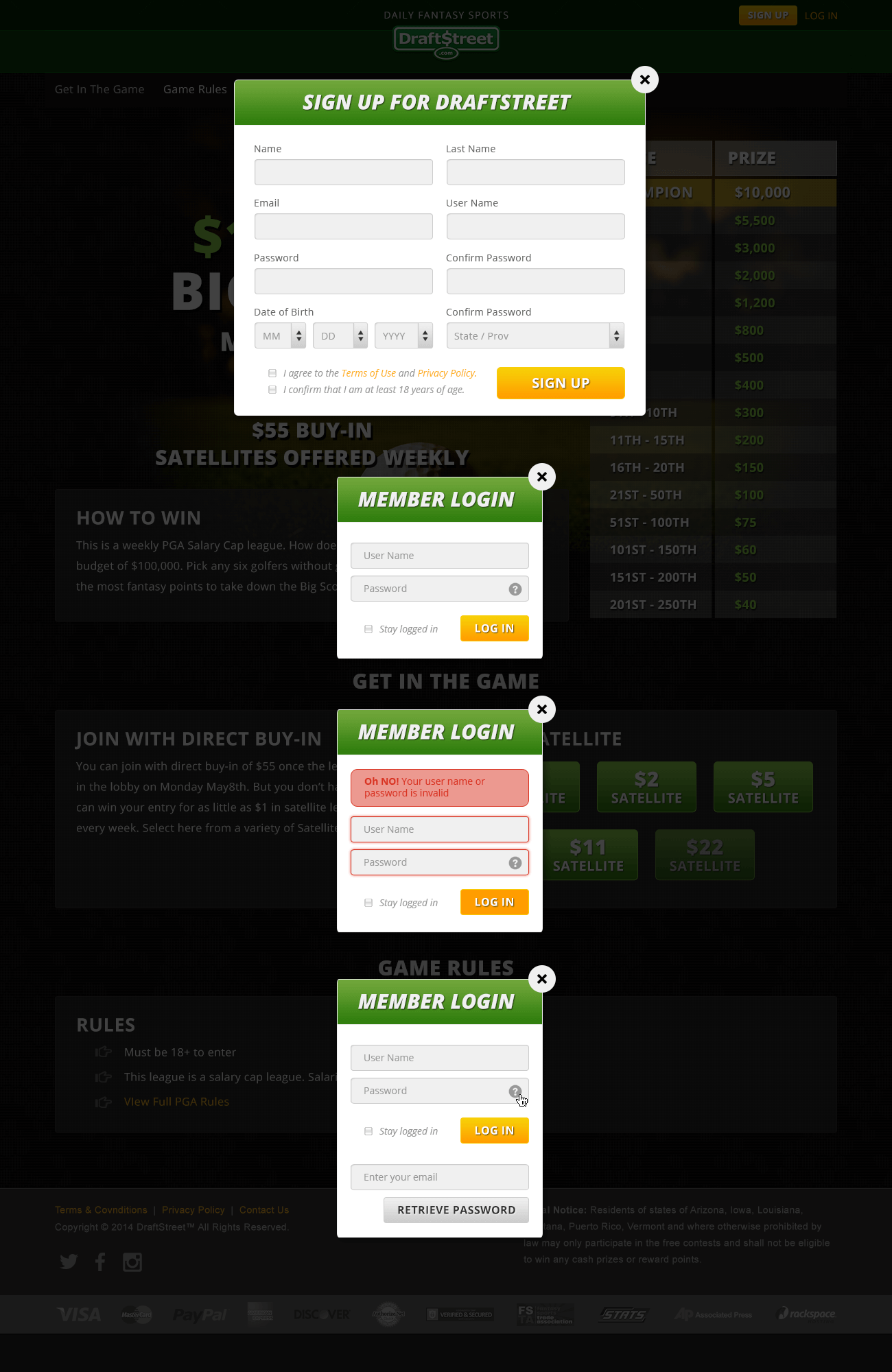
What I Built
1. The Core Flow Optimization: "Free Game" Onboarding
Original Flow:
Accept voucher → Create account → Select game → Build team → Enter contest → Watch live game → View leaderboard → Results
Accept voucher → Create account → Select game → Build team → Enter contest → Watch live game → View leaderboard → Results
The problem:
New users are taken directly to the "create account" screen—massive drop-off.
New users are taken directly to the "create account" screen—massive drop-off.
My hypothesis:
Let users build a team before asking them to create an account. Once they've invested time, they're more likely to sign up.
Let users build a team before asking them to create an account. Once they've invested time, they're more likely to sign up.
New Flow:
Accept voucher → Build team → Select game → Create account → Enter contest → Watch live game → View leaderboard → Results
Accept voucher → Build team → Select game → Create account → Enter contest → Watch live game → View leaderboard → Results
Result:
40% increase in sign-up conversions.
Why it worked:
Users experienced the product's value (building a fantasy team) before committing to it. The act of building created psychological investment.
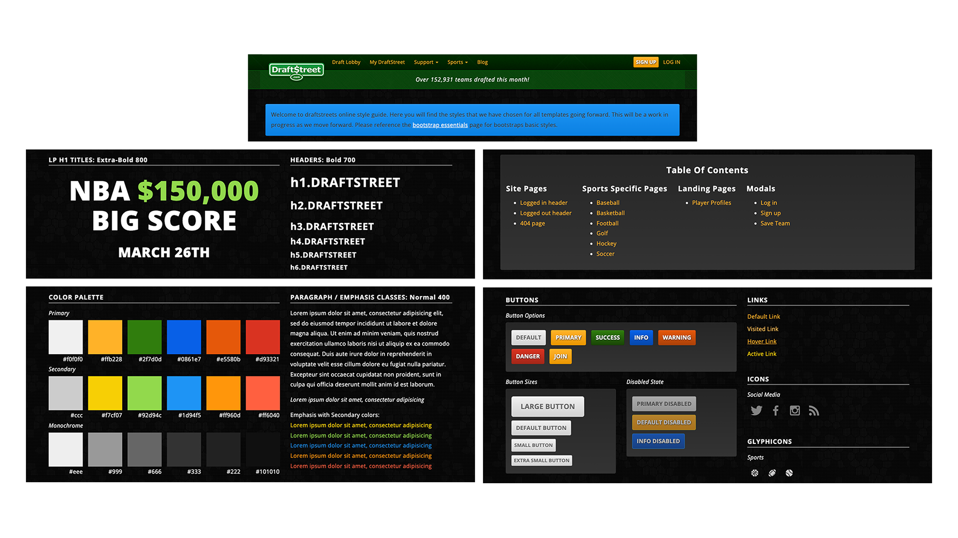
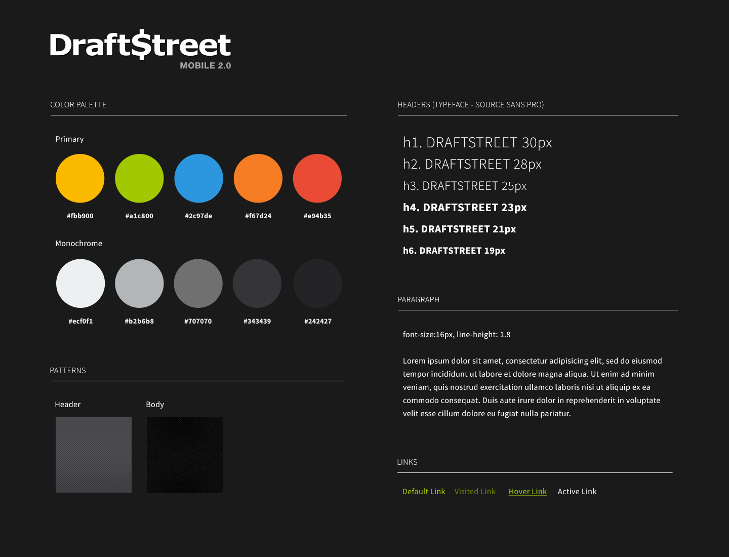
redesigned style guides
2. Responsive Mobile App (Built on Bootstrap)
Challenge: Build a mobile-first app that also works on desktop—without maintaining two separate codebases.
Solution:
Built scalable UI using Bootstrap CSS framework with custom sports iconography and DraftStreet theming.
Built scalable UI using Bootstrap CSS framework with custom sports iconography and DraftStreet theming.
What this enabled:
• Consistent experience across devices
• Faster development (reusable components)
• Light and dark interactive themes
• Easy retrofitting of a desktop app with RWD
Design System:
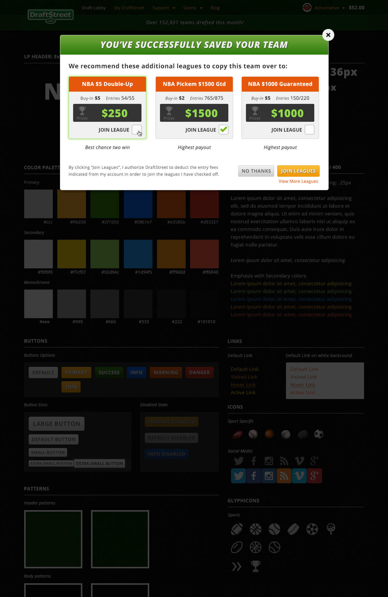
Created comprehensive style guides, component library, and interactive prototypes that engineers could build from directly.
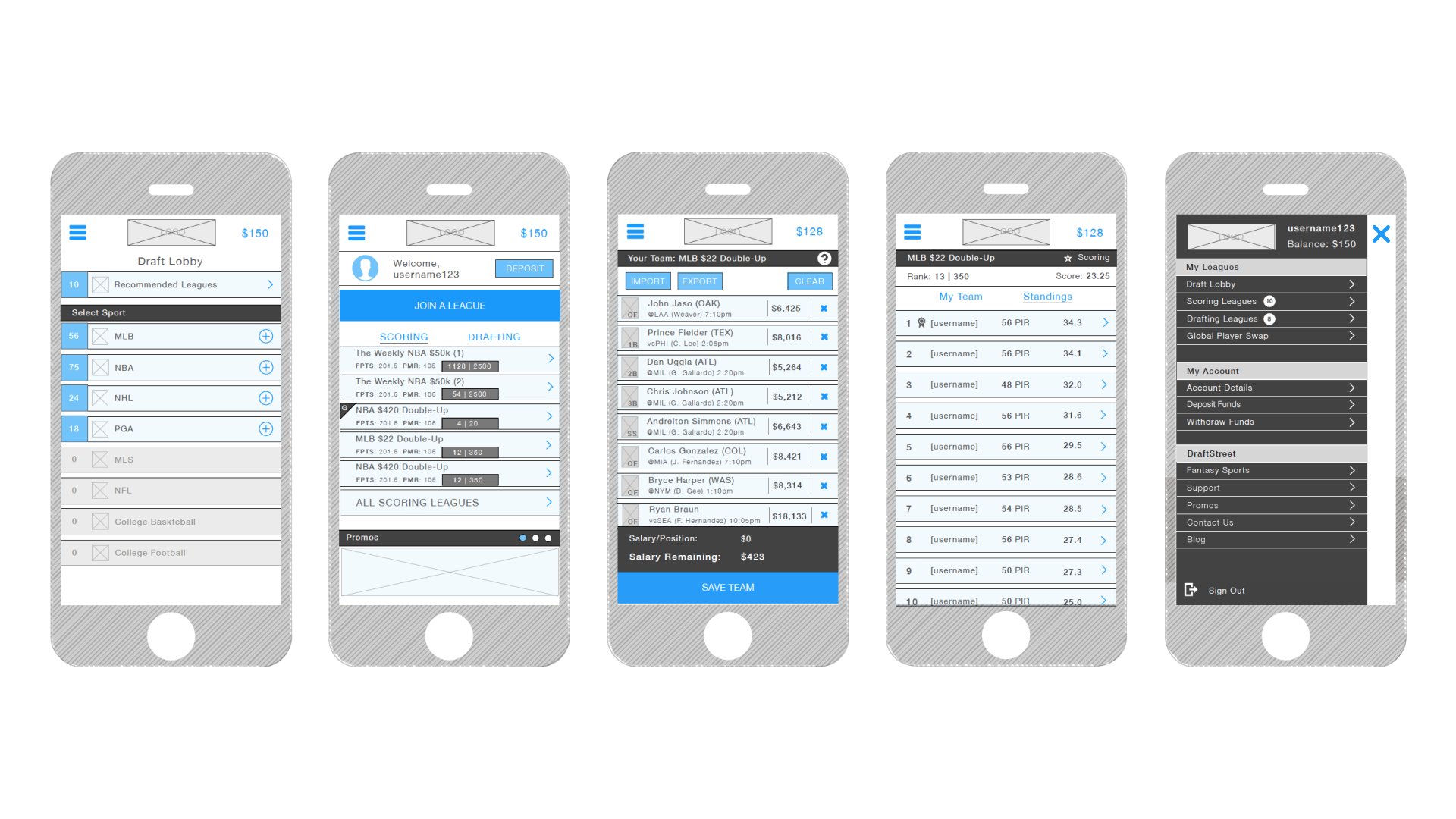
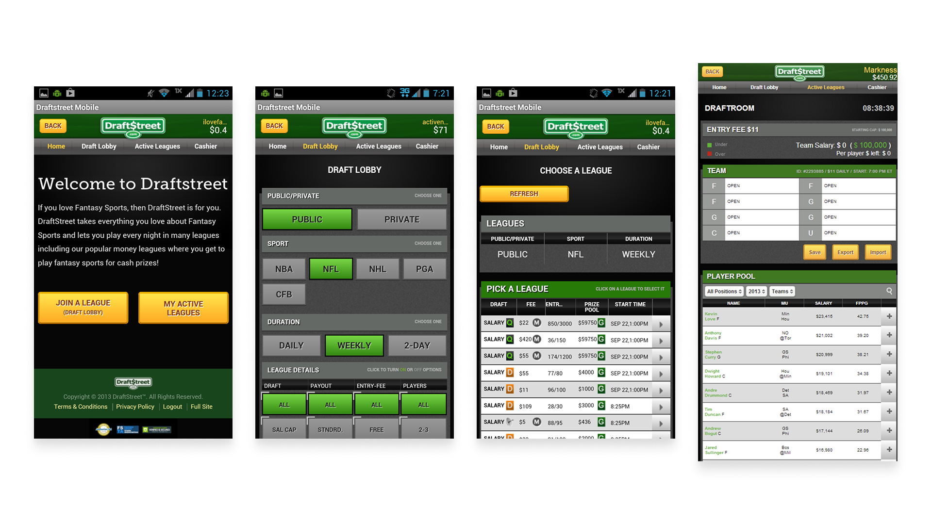
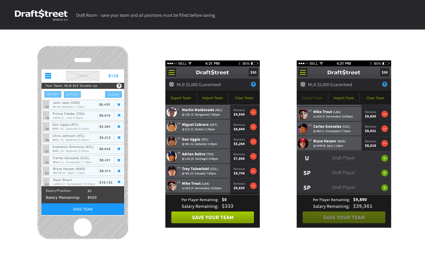
draft lobby, lineup, and navigation wireframes
3. Key User Flows
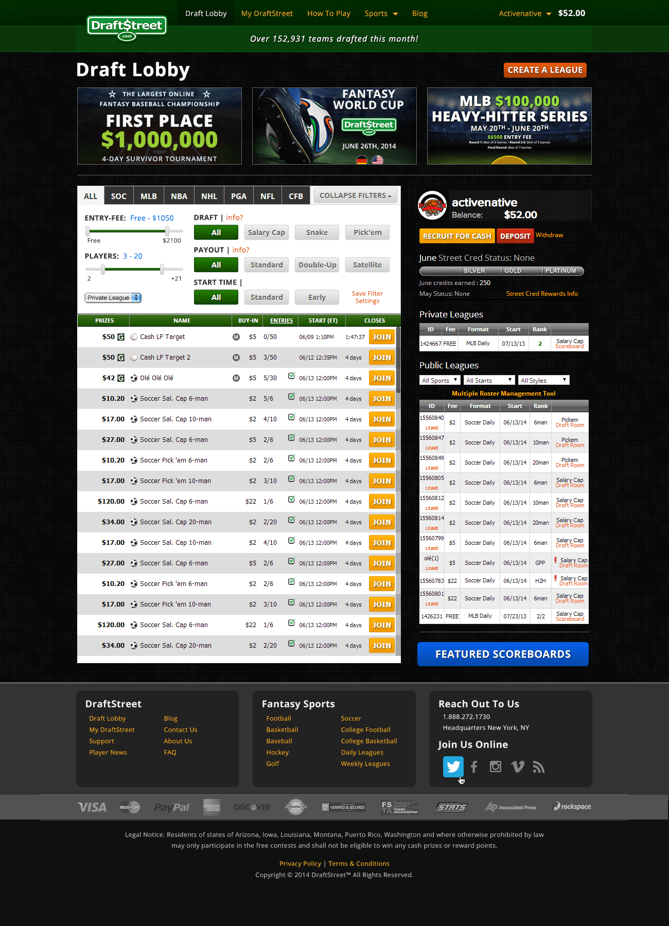
Enter multiple contests with a single team.
Users could create one lineup and enter it into multiple contests—reducing friction for experienced players.
Users could create one lineup and enter it into multiple contests—reducing friction for experienced players.
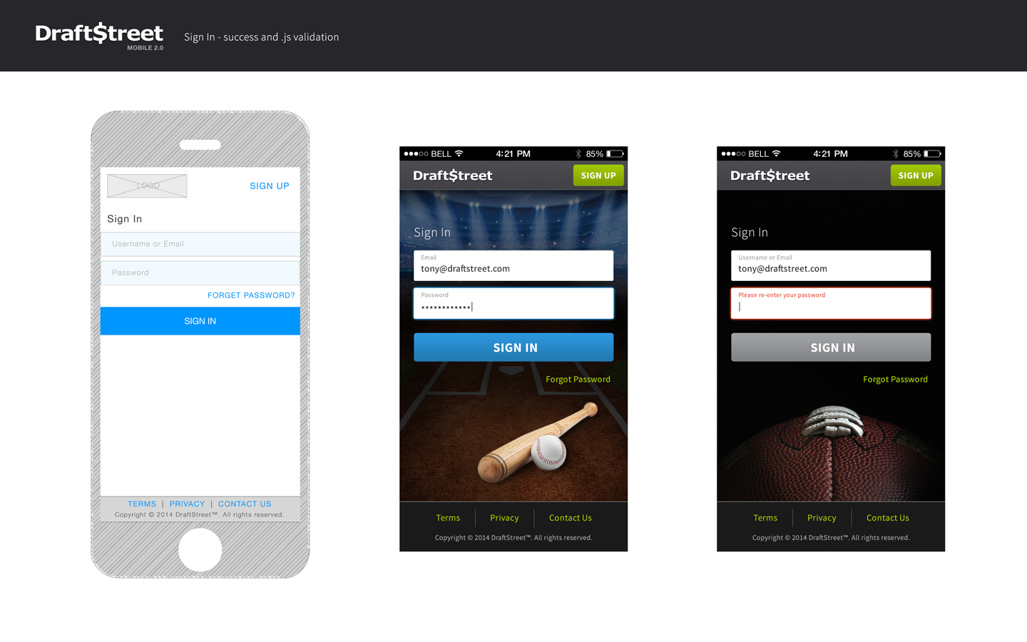
Verify account / KYC (Know Your Customer)
Legal requirement for real-money gaming. Made the flow as painless as possible while meeting compliance.
Legal requirement for real-money gaming. Made the flow as painless as possible while meeting compliance.
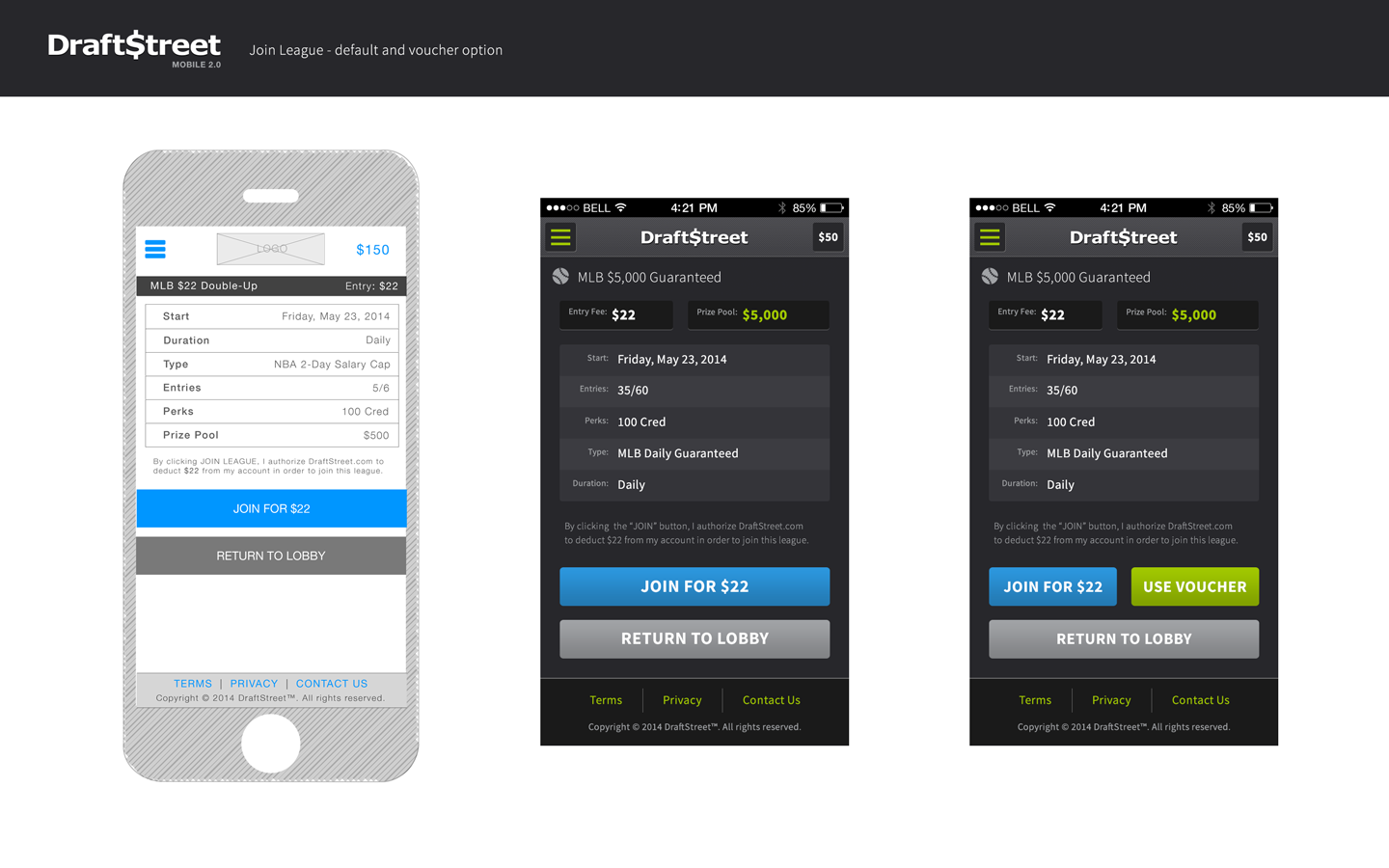
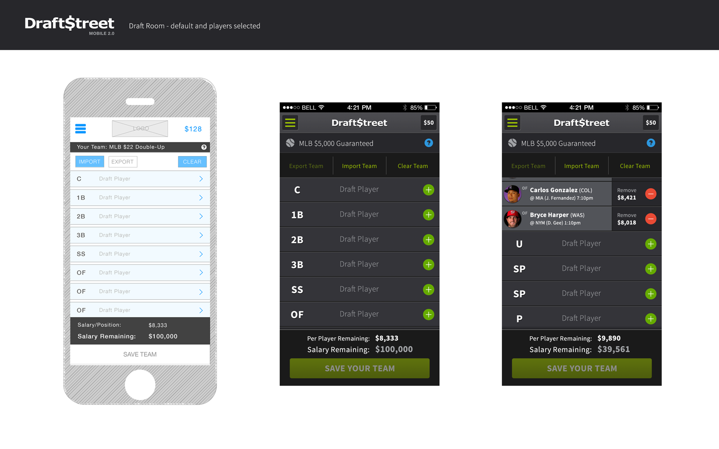
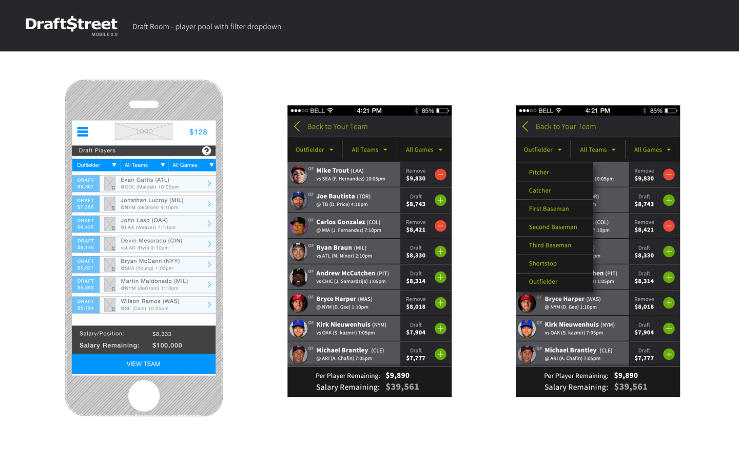
Build & Edit Team
Simplified player selection, made the salary cap visible, and added quick-swap functionality.
Simplified player selection, made the salary cap visible, and added quick-swap functionality.
Deposit Money / Withdraw Funds
Secure payment flows with clear transaction history.
Secure payment flows with clear transaction history.
View Leaderboard
Real-time scoring during live games—the most engaging part of the experience.
4. Competitive Differentiation: Satellite Contests
DraftStreet's unique advantage:
Offered satellite contests where users could qualify for high-stakes competitions with smaller buy-ins.
My focus:
Made satellite contest mechanics clear in the UI. Users needed to understand they were playing for entry into bigger contests, not just cash prizes.

Wireframes to high-fidelity mockups
Process: Weekly Sprints with Twice-Weekly Design Reviews
Team:
• 1 Product Manager
• 1 Product Designer (me)
• 1 In-house Front-End Engineer
• 4 Remote Back-End Engineers
Workflow:
• 1-week sprints with design reviews on Monday and Friday
• Daily collaboration with CPO and Product Manager to define requirements
• Direct work with a front-end engineer to build interactive prototypes for user testing
• Wireframes → High-fidelity mockups → Prototypes → User testing → Iterate
Research activities:
• User personas based on interviews
• Competitor analysis (DraftKings, FanDuel)
• App audit comparing mobile vs. desktop experience
• User flow mapping and optimization
• Continuous user testing with the internal team and external users
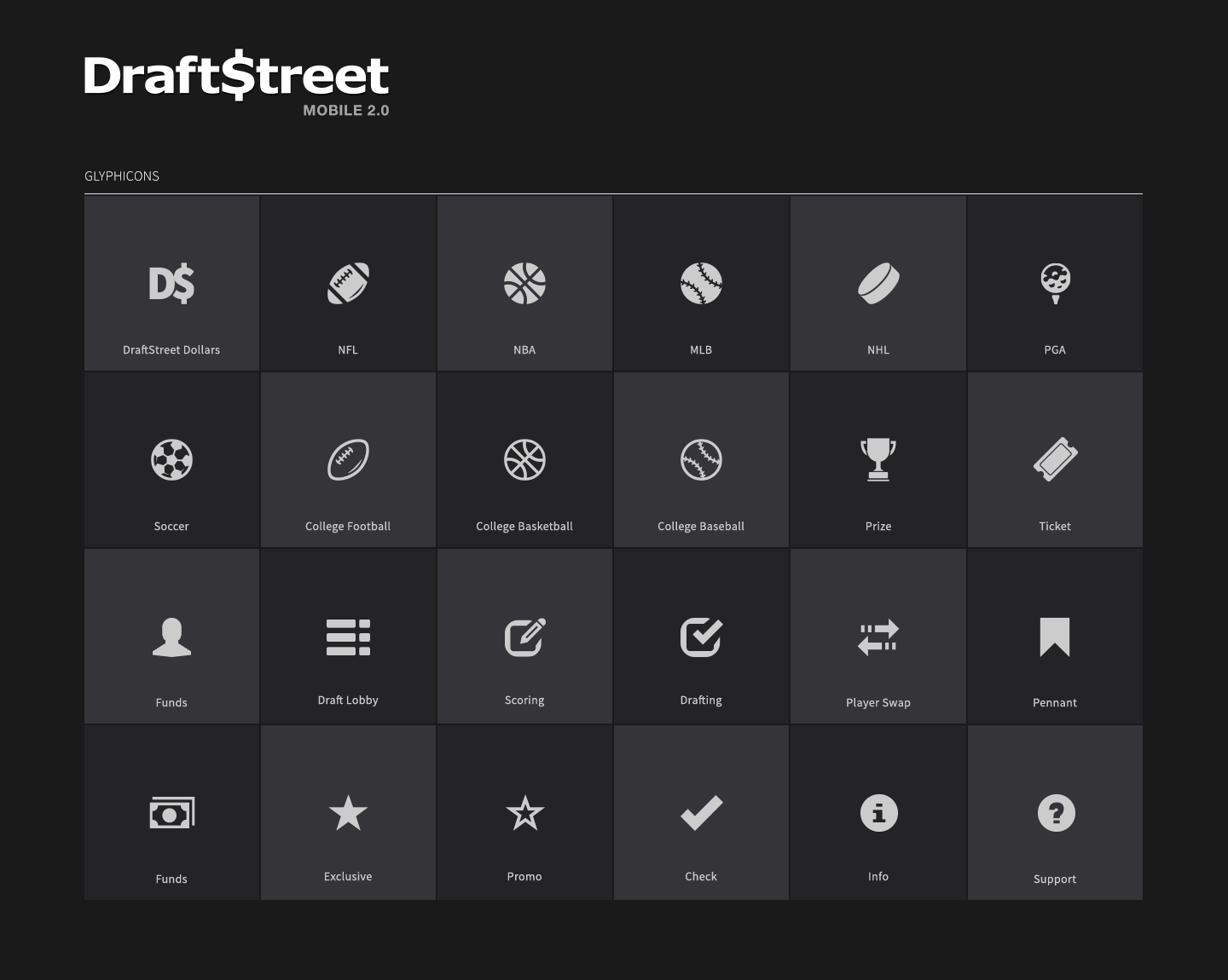
DraftStreet mobile 2.0 iconography and styles
Design Decisions
Bootstrap CSS Framework
Why: Needed speed and consistency. Bootstrap provided robust components I could customize, allowing me to focus on UX and interactions rather than building the UI from scratch.
Light & Dark Themes
Why: Users play fantasy sports late at night. Dark theme reduced eye strain during evening games.
Custom Sports Iconography
Why: Generic icons didn't convey football/basketball/baseball context quickly enough. Custom icons made scanning player stats faster.
Retrofitting Desktop App
Why: Couldn't abandon existing users while building mobile. Used the same design system to update the desktop app with RWD, maintaining consistency across platforms.
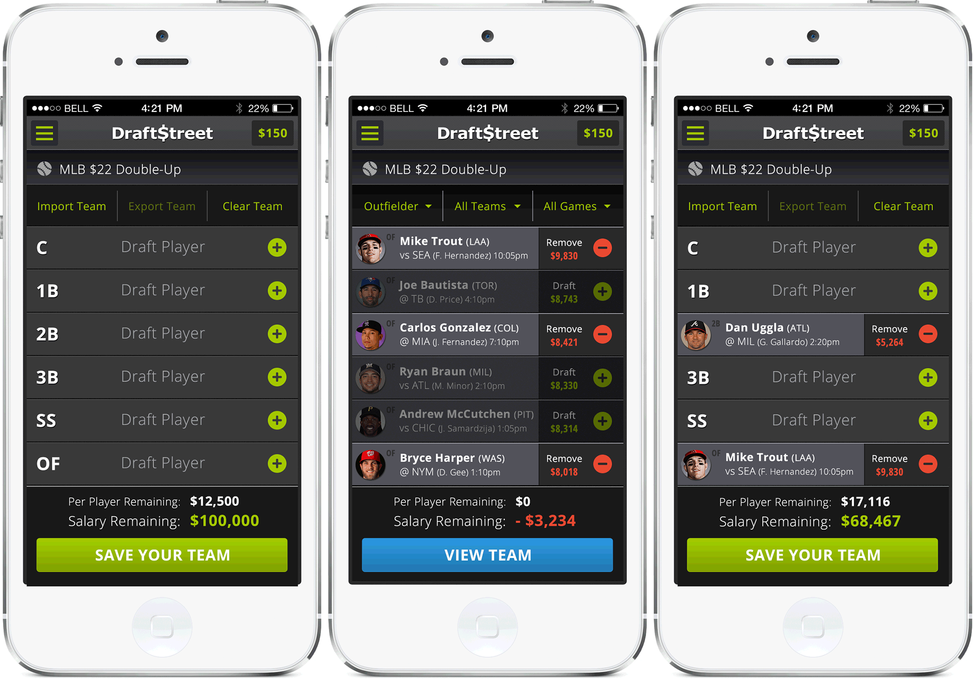
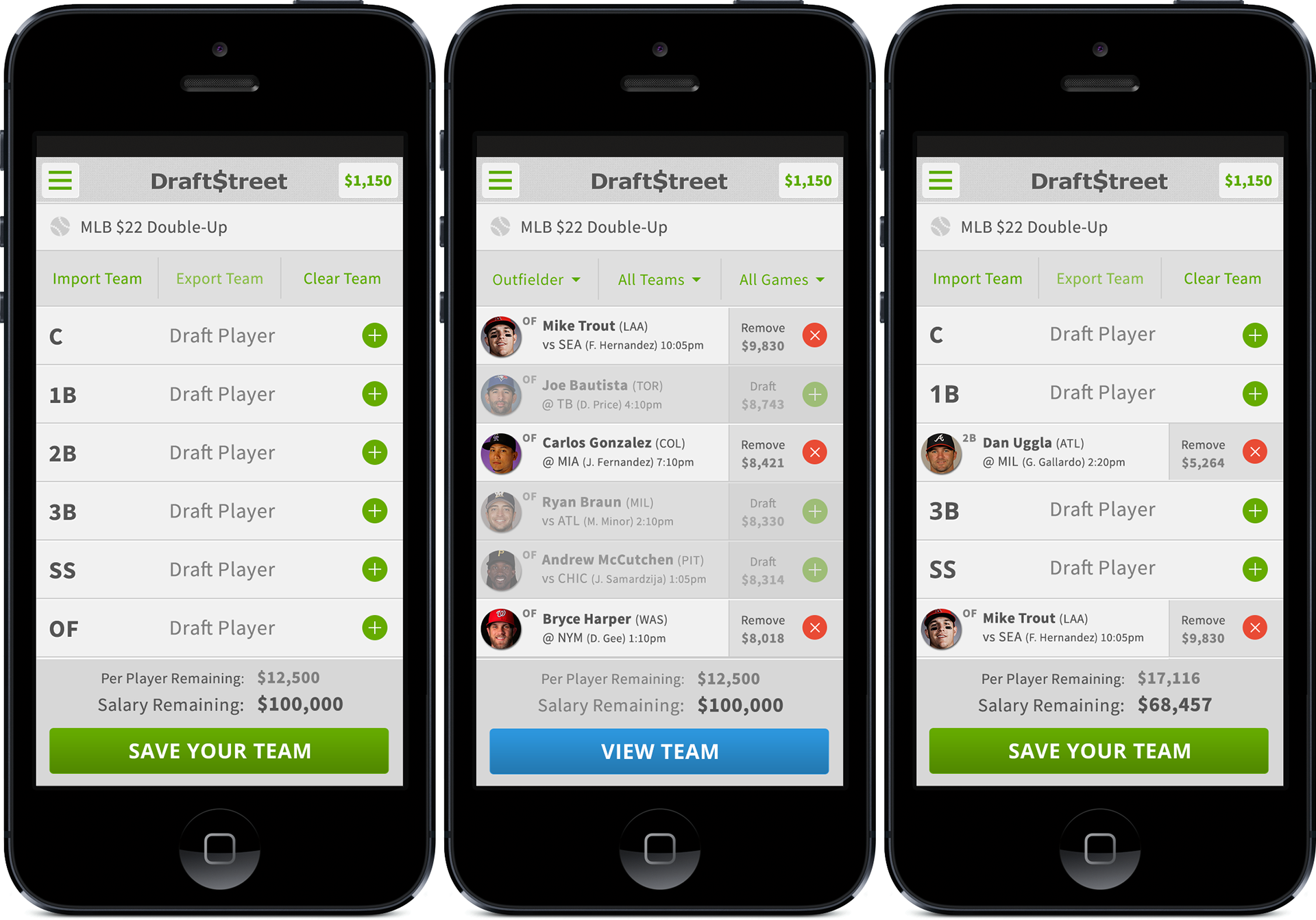
light and dark themes
The Outcome
We built a working MVP and tested it internally.
But we never launched it to users.
In summer 2014, DraftKings acquired DraftStreet—right before our planned September launch
Key Achievements
• Designed and developed a scalable mobile-first app in 8 months
• 40% conversion increase with redesigned onboarding flow
• Mobile-first strategy adopted by the executive team after presenting data
• Expanded team structure by advocating for PM and FE engineer hires
• Created a design system used for both mobile and desktop retrofitting
• Light and dark themes for a better user experience during evening gameplay
• Positioned the company for acquisition by demonstrating product vision
desktop lobby and dialogue components