Dahlia Cake Shop
Brand Identity | Web Design | Collateral
Camila Moura Hough had spent years refining her craft in Northern California bakeries, eventually becoming a lead pastry chef with a loyal following and a side hustle that had quietly outgrown the word "side." When she decided to launch Dahlia Cake Shop — her own small-batch cake business rooted in coastal California flavors — she needed a brand that could carry both the quality of her product and the warmth of her story.
Having worked alongside Camila as a bakery manager, I had a unique client relationship: I understood her ethos from the inside. The challenge wasn't learning who she was — it was translating that authenticity into a visual identity that could hold its own against established competitors while still feeling personal and handcrafted.
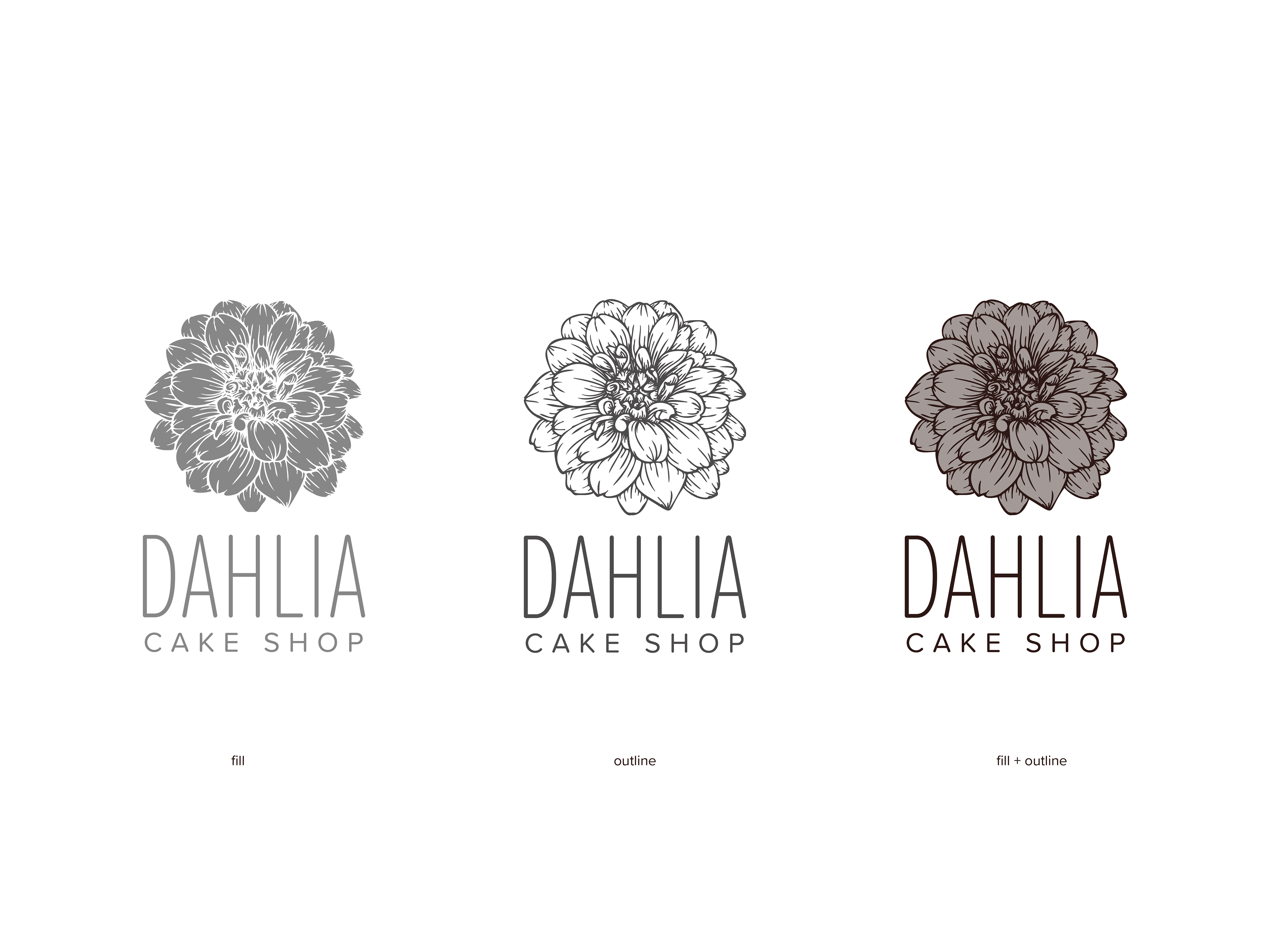
logo deconstruction
The Strategy
Dahlia occupies a specific niche: premium, small-batch cakes for customers who care about ingredients, craft, and experience. The brand needed to feel elevated without feeling cold — the visual language of a patisserie, but with the soul of a home baker who genuinely loves what she makes.
Three brand tensions shaped every decision:
• Artisan vs. polished — handmade quality, professionally presented
• Intimate vs. scalable — rooted in a personal story, but built to grow
• Delicate vs. confident — floral softness without feeling precious or generic
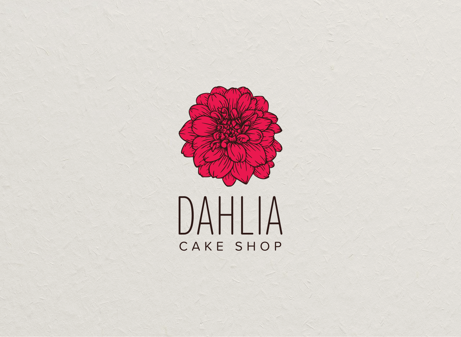
The dahlia itself became the anchor. Unlike roses or generic florals, dahlias are bold and architecturally complex — they deserve a closer look. That felt true to the product.
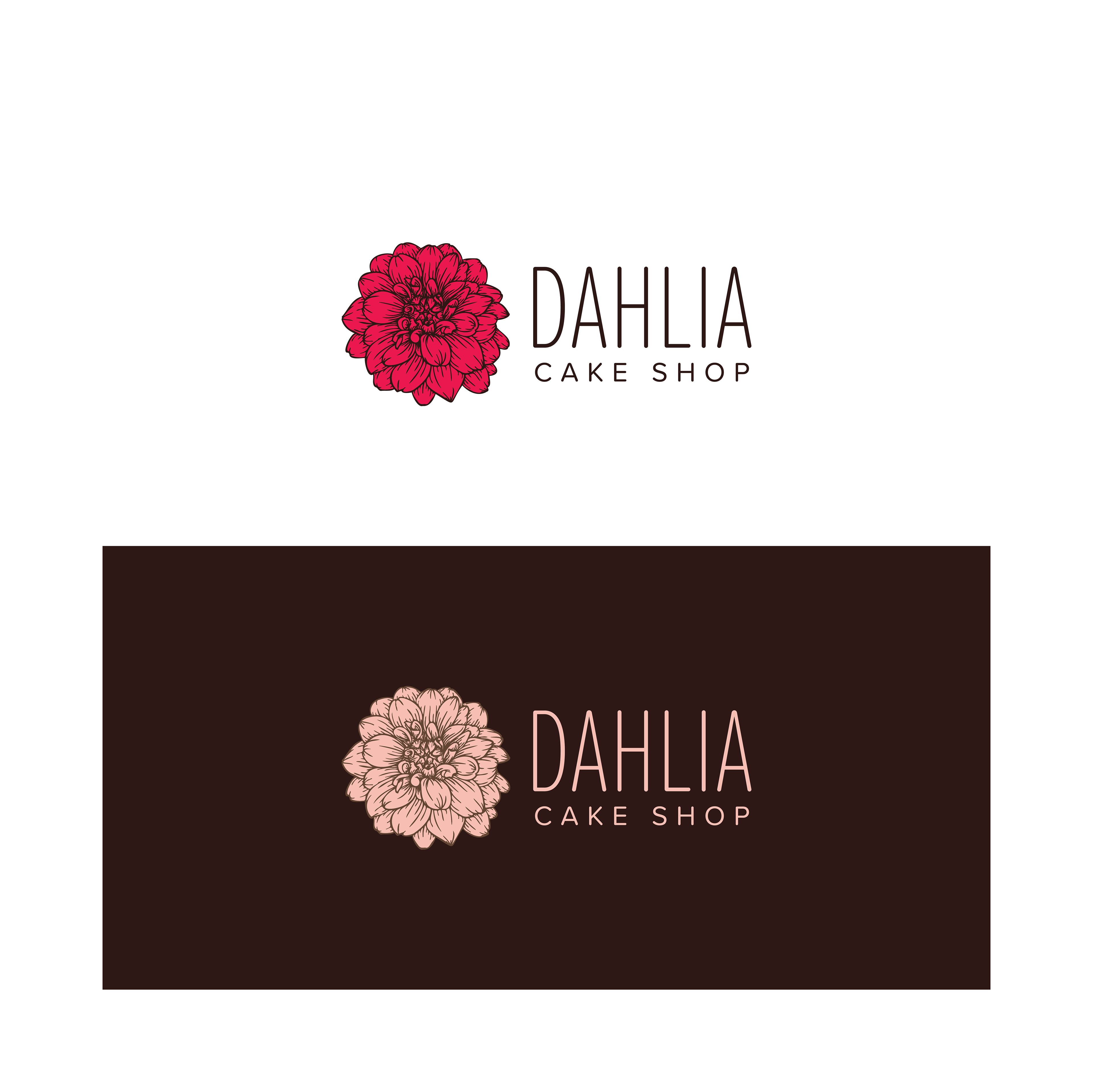
primary logo stack
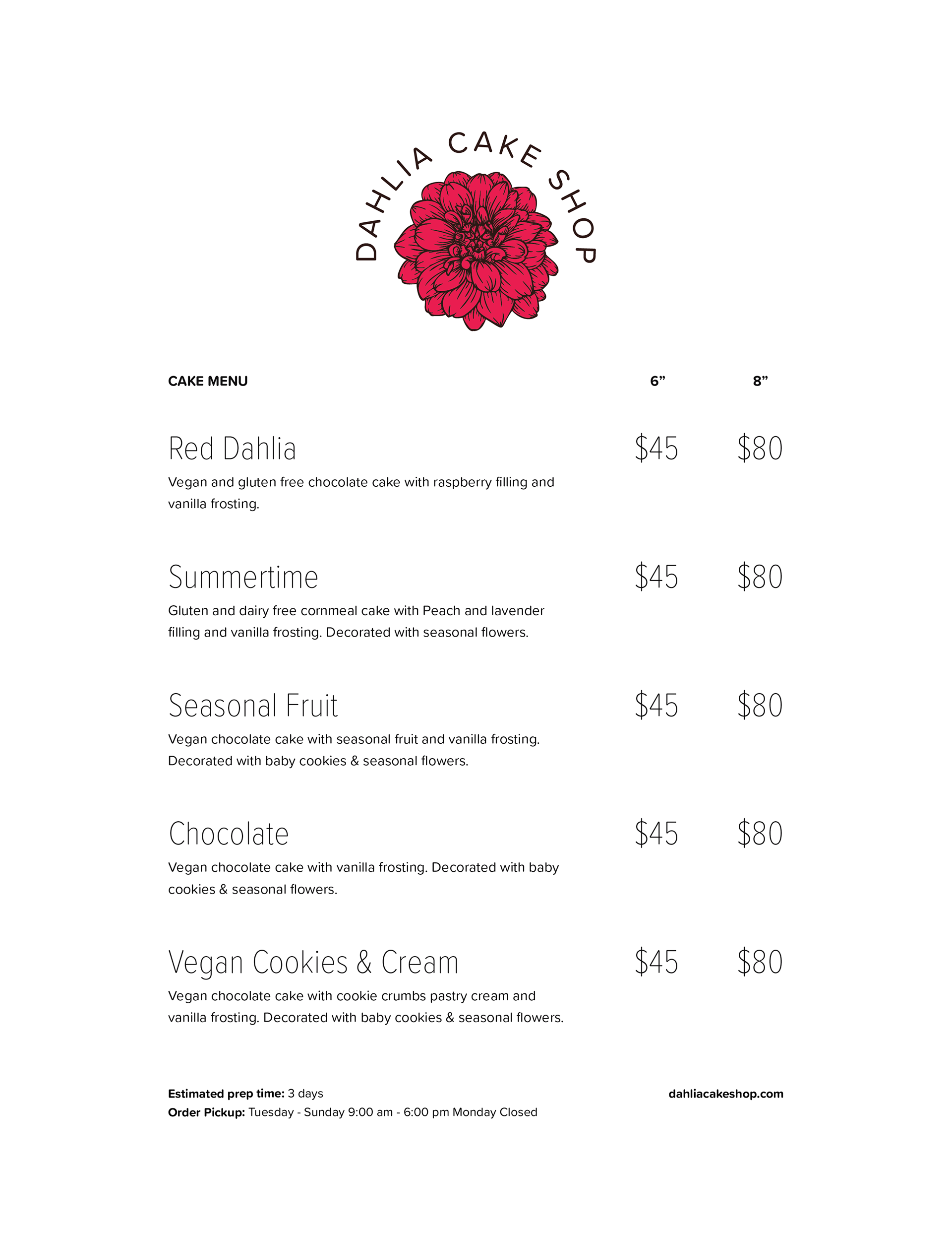
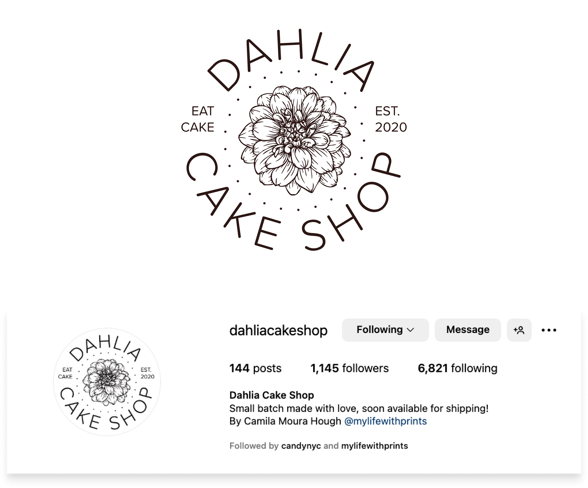
The Identity
The primary logo pairs a detailed dahlia illustration with a refined serif wordmark. The illustration is layered and precise — a nod to Camila's technical skill — while the lettering keeps it contemporary rather than nostalgic. A secondary badge lockup gives flexibility across smaller formats without losing brand recognition.
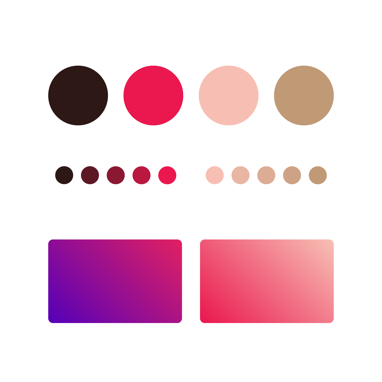
The color palette centers on warm, dusty tones — muted pinks, deep plums, and soft creams — evoking both the cakes themselves and the Northern California coastal light. Gradients extend the palette into digital contexts, giving the social media presence a sense of depth and texture that flat color couldn't achieve.
The brand uses a single typeface throughout — a deliberate choice that prioritizes cohesion over contrast. Rather than pairing a display face with a utility face, the identity relies on weight, scale, and spacing to do the work of hierarchy. This keeps the system tight and easy to maintain across every touchpoint, from the logo wordmark to menu copy to Instagram captions.
color palette & gradient options
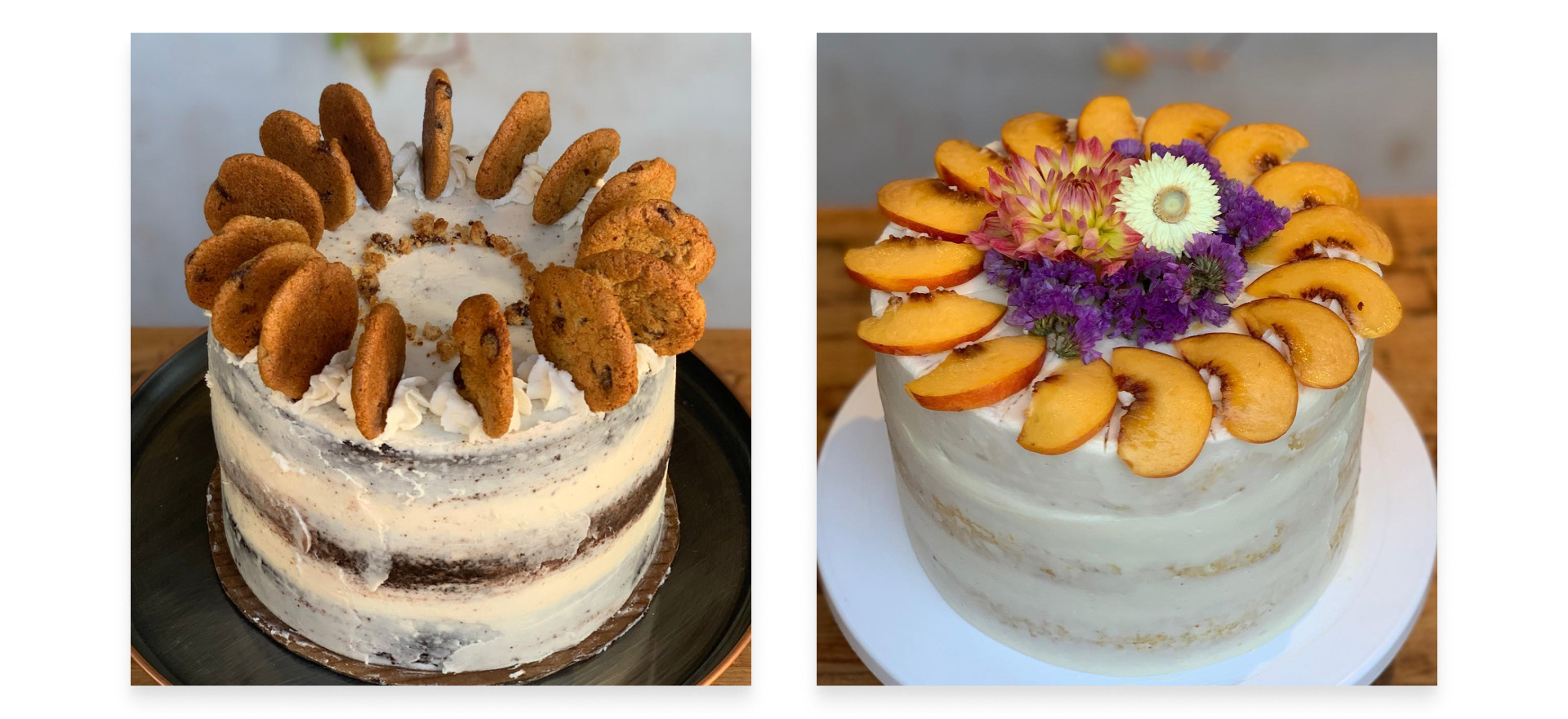
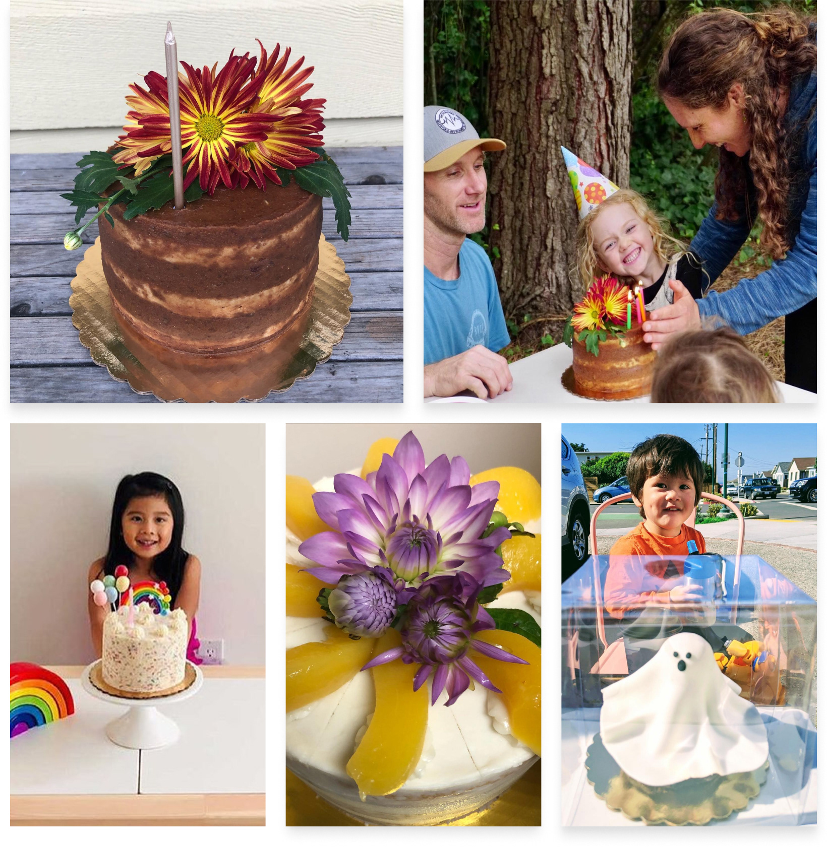
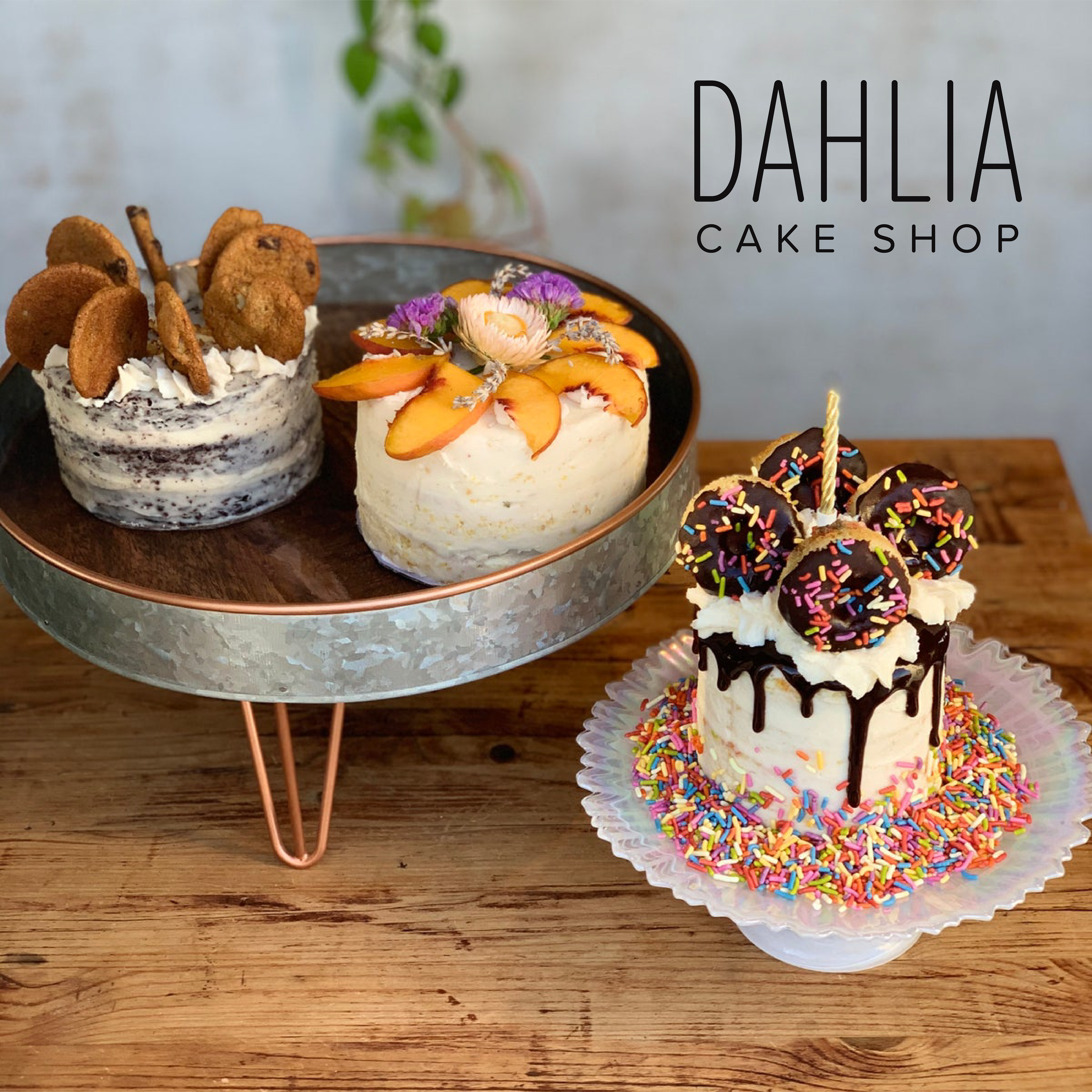
cookies & cream and summertime cakes
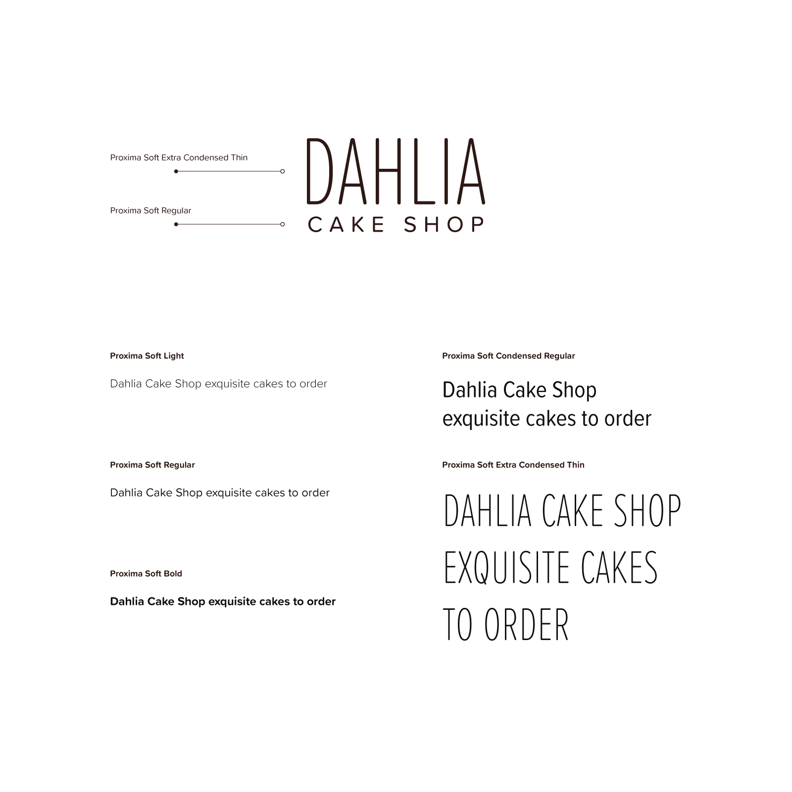
typeface
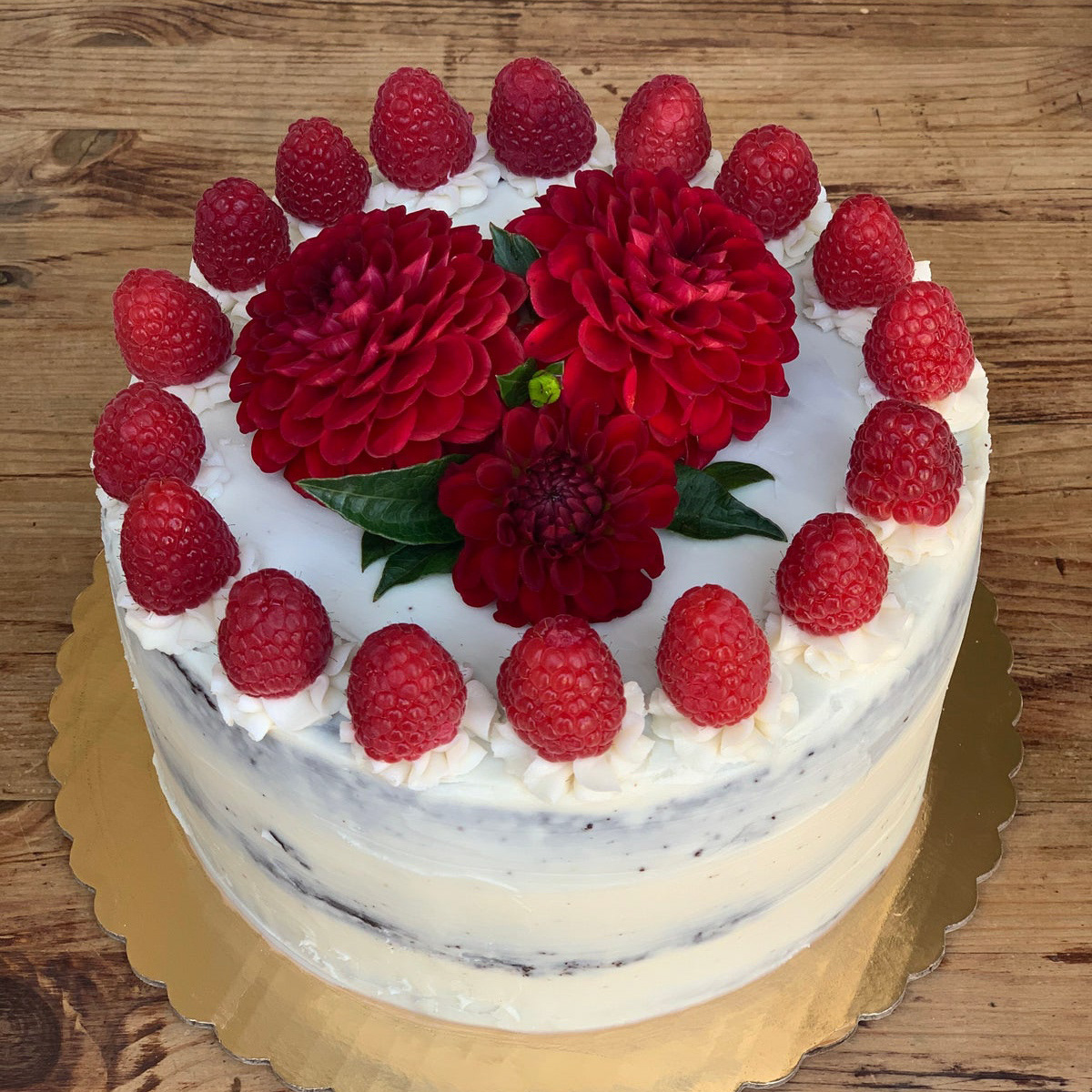
vegan red dahlia cake
The Deliverables
The full brand package included primary and secondary logo systems, a complete color palette with gradient variants, business cards and stickers, social media templates, letterhead, and a custom website. Every touchpoint was designed to work together as a system — so whether a customer encounters Dahlia on Instagram, receives a sticker with their order, or visits the site, the experience feels cohesive and considered.
horizontal lockup
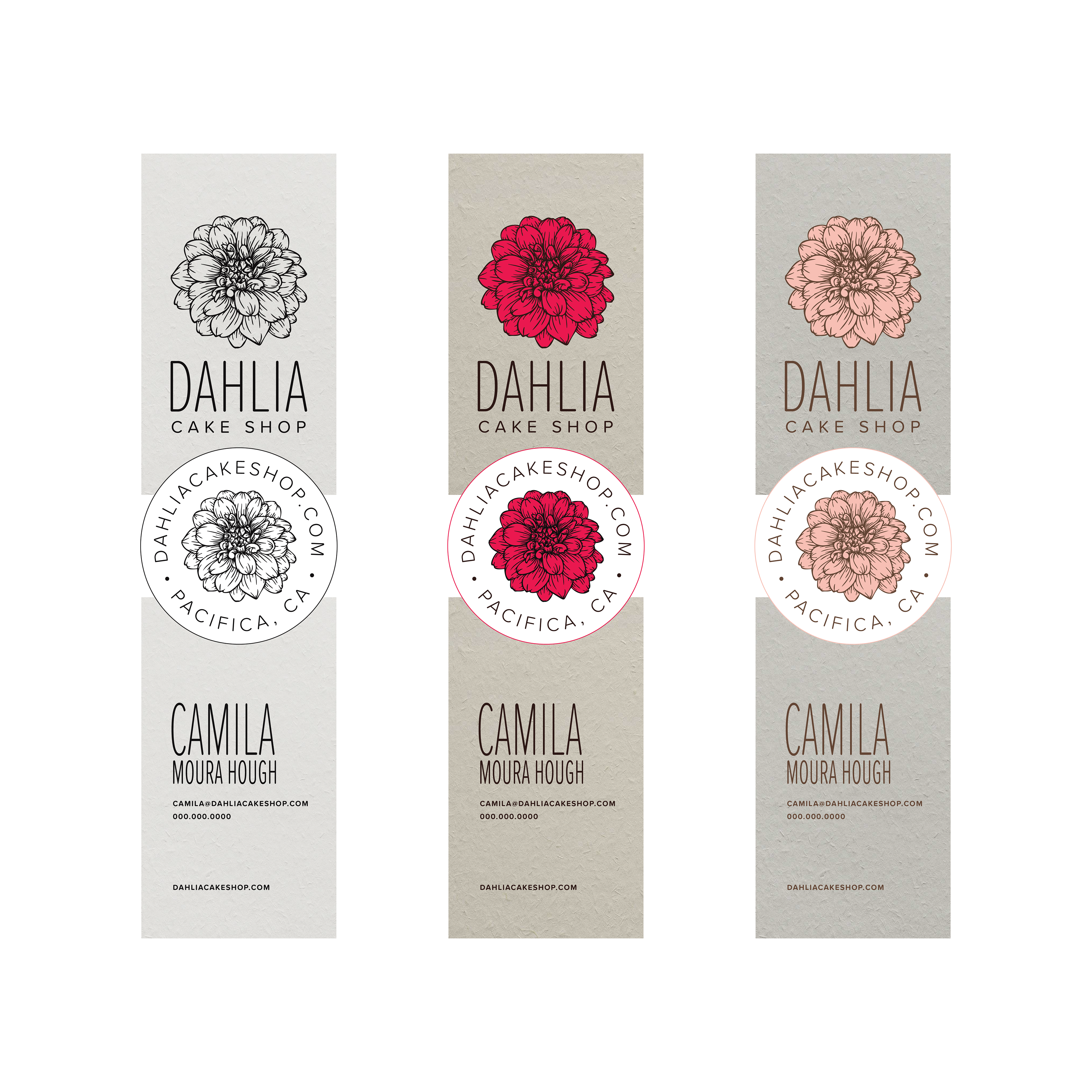
business card and 2" sticker options
The Result
Dahlia Cake Shop launched to an enthusiastic response from Camila's existing audience and quickly attracted new customers through its social presence. The brand gave her business the professional foundation to move from word-of-mouth hustle to an established local brand — exactly what the identity was designed to support.
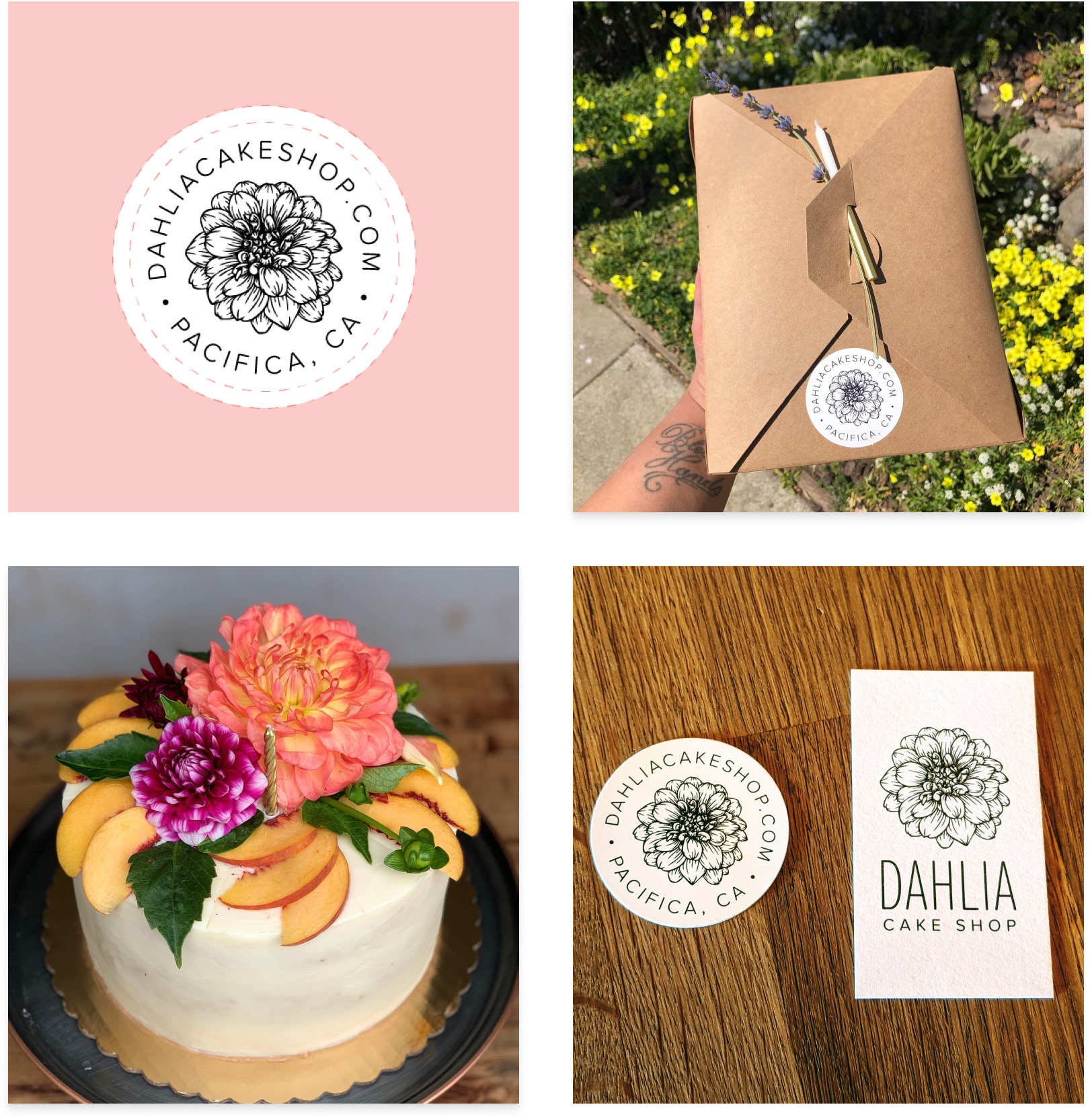
social media profile badge
"Tony translated everything I'd been envisioning into something that finally looked like what Dahlia felt like to me." — Camila Moura Hough, Founder