Cape Atlantis Shells LLC
Your Source for Premium Crushed Clamshells
Cape Atlantis Shells LLC is a company based in New Jersey that specializes in supplying and delivering crushed clamshells for driveways and landscapes.
After helping this successful entrepreneur with his initial venture, Yurt Painting Co, I was thrilled to be asked to launch a new project that aligns with my passion for promoting sustainable practices. With that in mind, I offered to assist in any capacity and provide my services within his budget.
Role
• Brand Designer
• Web Developer
• Copywriter
Branding Starter Package
The project exemplifies the comprehensive branding starter package I offer clients embarking on a new business. Recognizing the distinct needs of each client, I tailor deliverables, such as van decals in this instance, to ensure scalability and adaptability across diverse touchpoints.
Brand Package
• Primary, secondary, and tertiary marks
• Color palette and gradients
• Social media assets
• Business cards
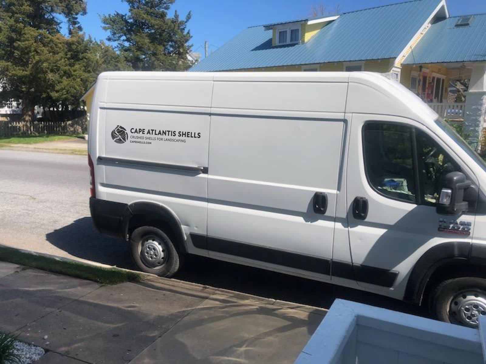
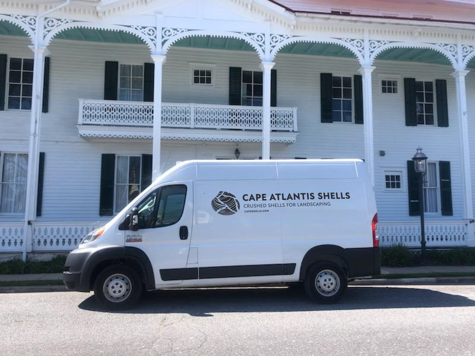
• Van decals
• Letterhead
• Typeface
• Website
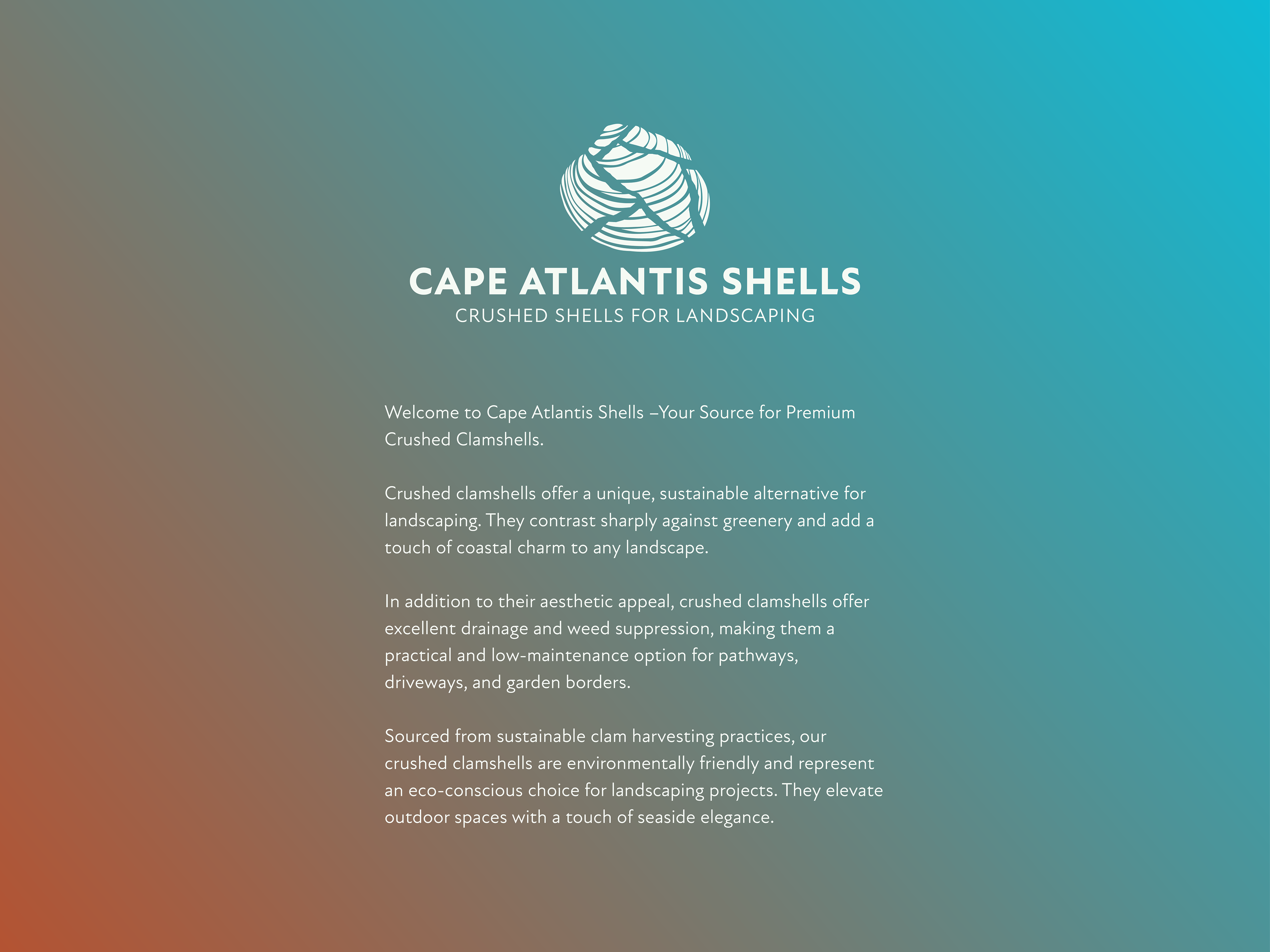

vertical placement
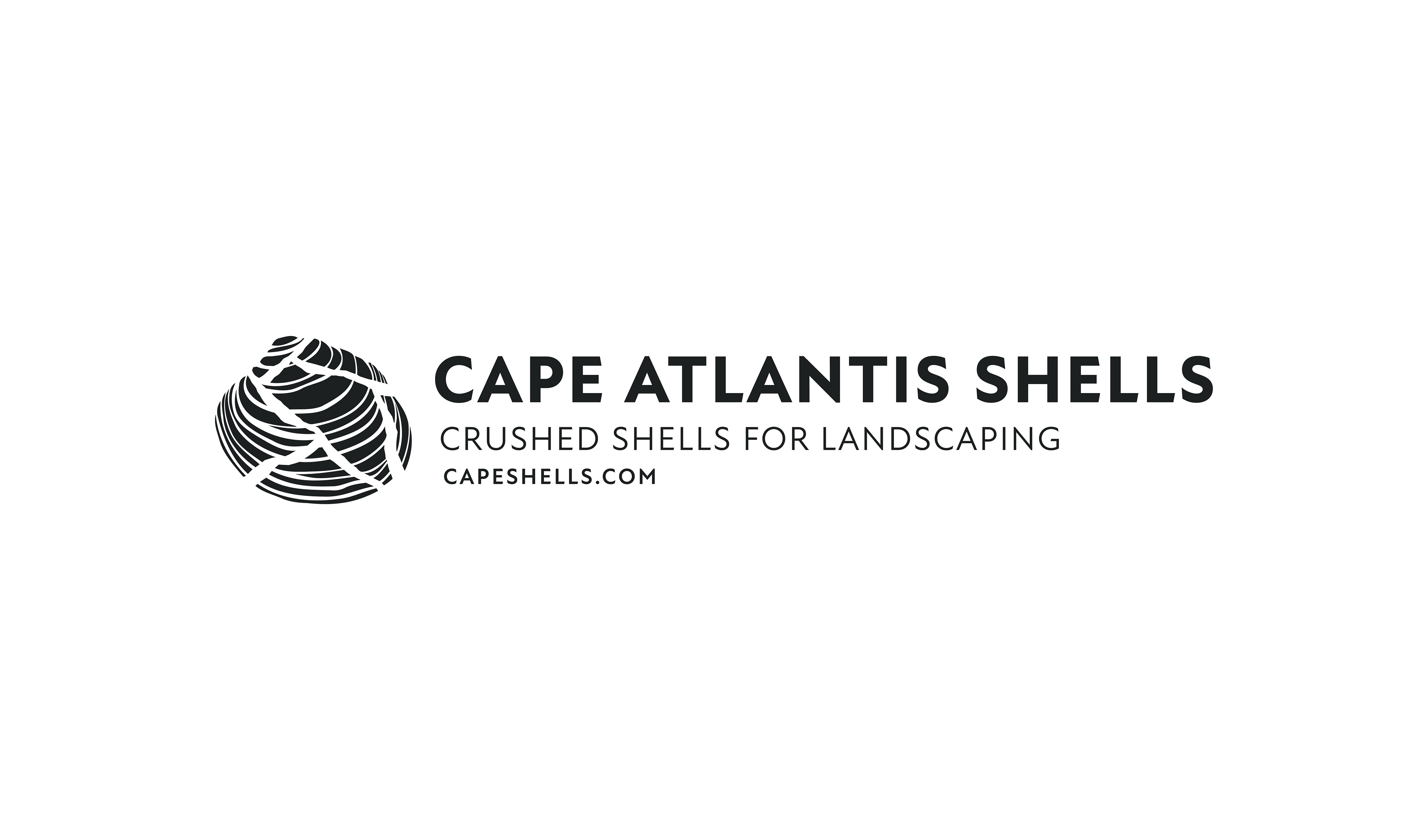
horizontal placement
tertiary mark

icon
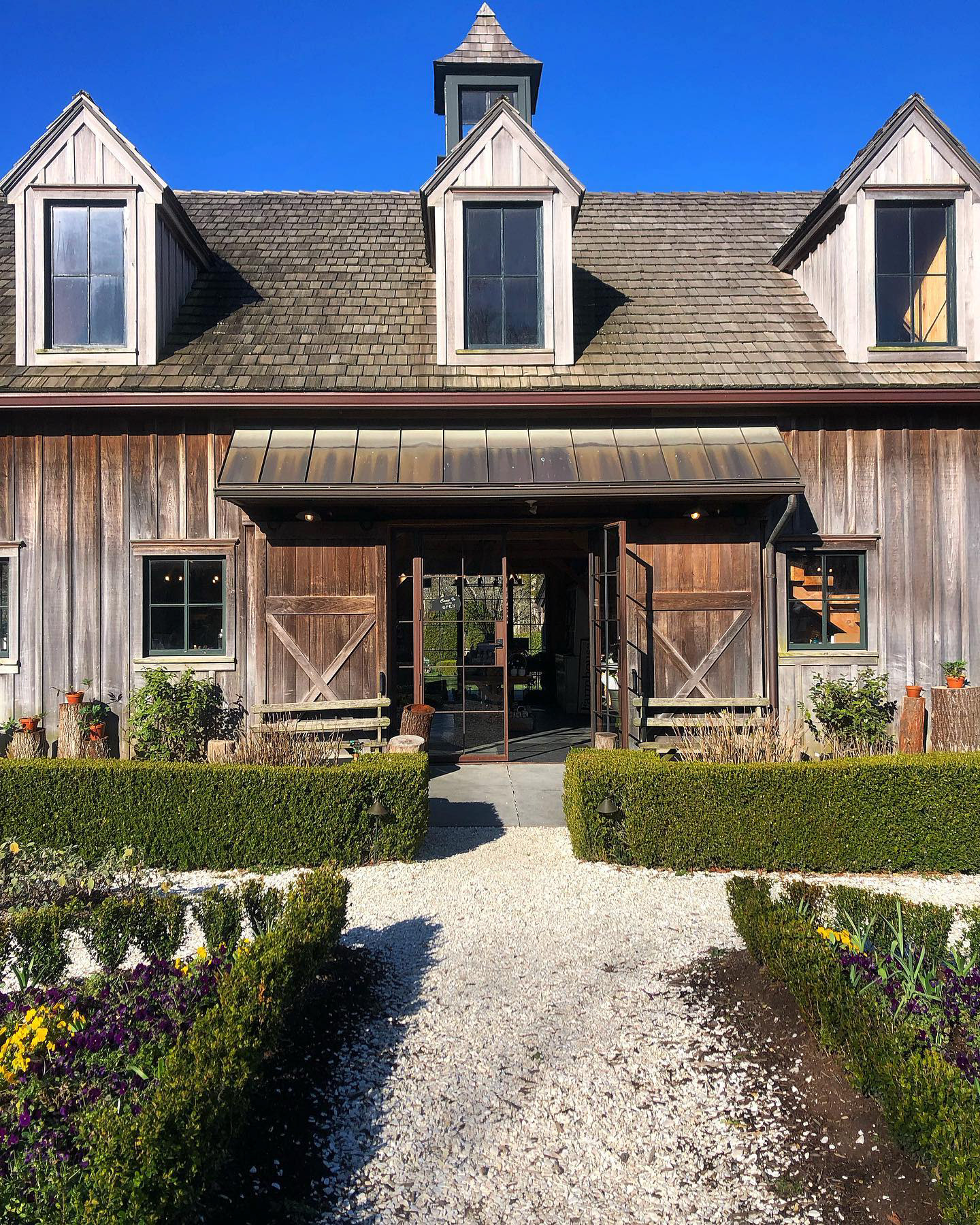


Mission
Cape Atlantis Shells is committed to enhancing outdoor spaces for homeowners and businesses by providing sustainable and eco-friendly landscaping solutions using premium crushed clamshells.
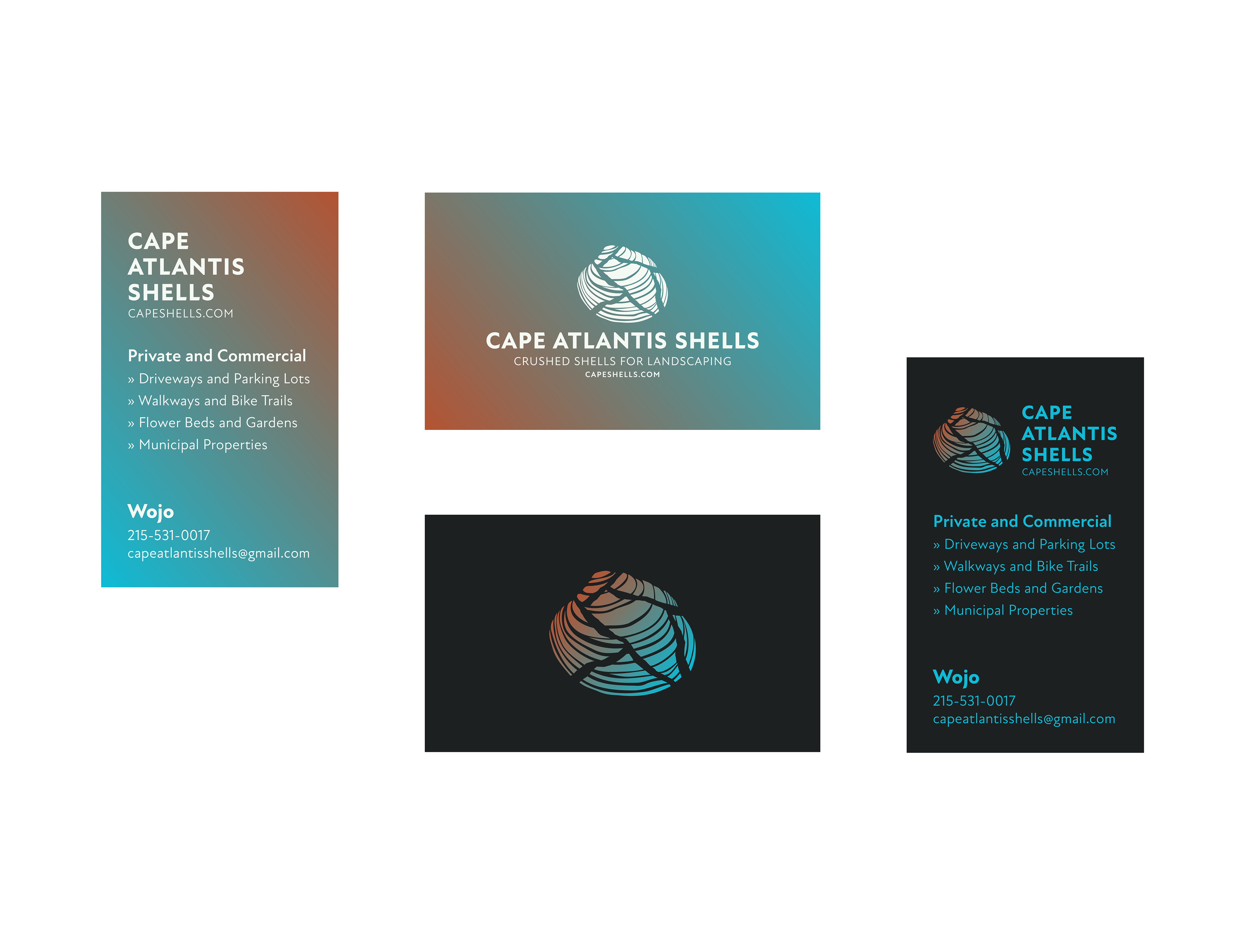
business cards

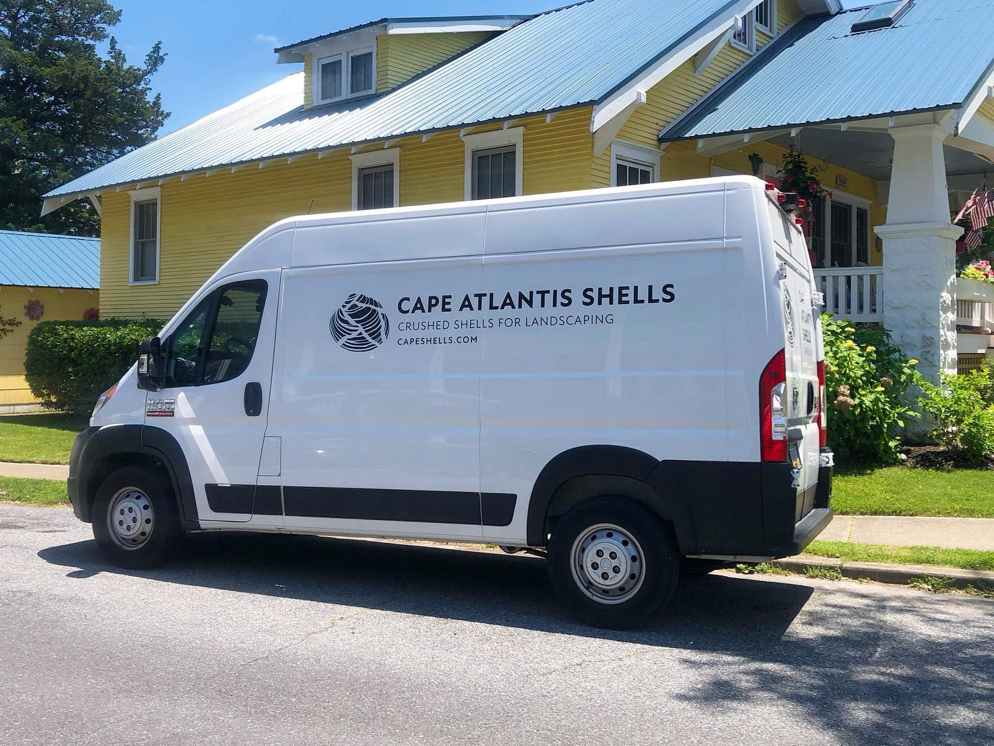
Van Decals
The finished decals depicted in the images above are unaltered, while the Photoshop mockups of the van are below. I provided the printer with vector graphics and these van mockups.

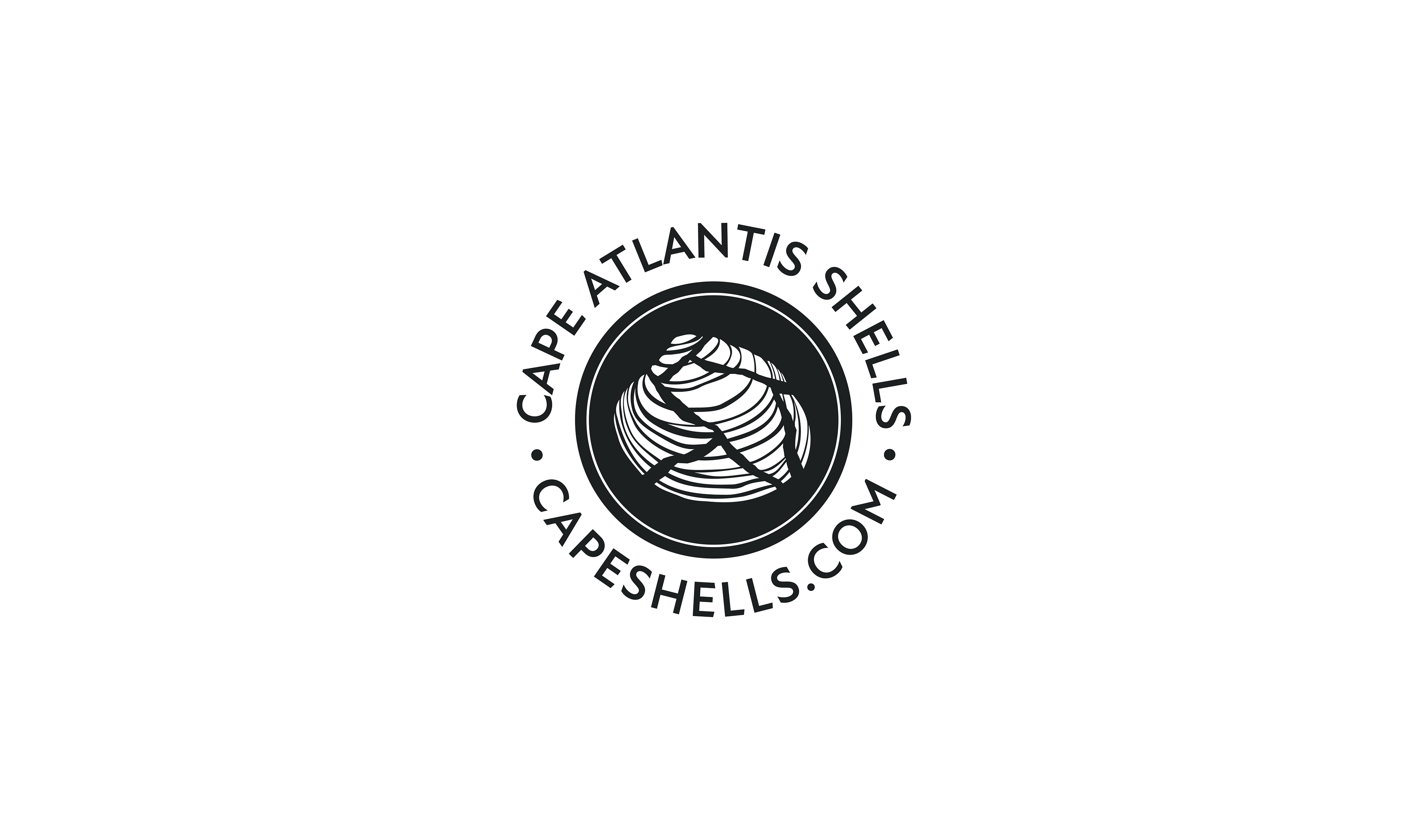
social media mark

icon with URL


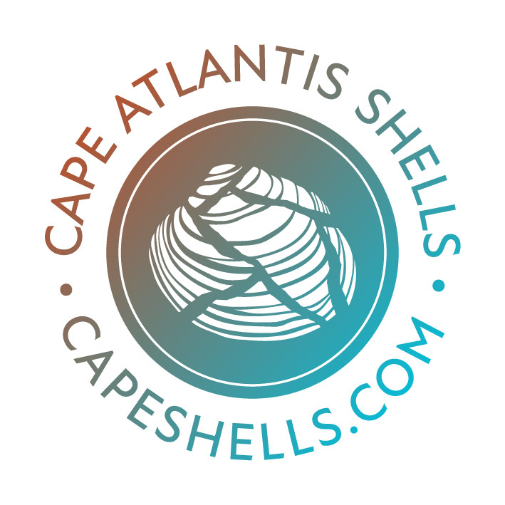


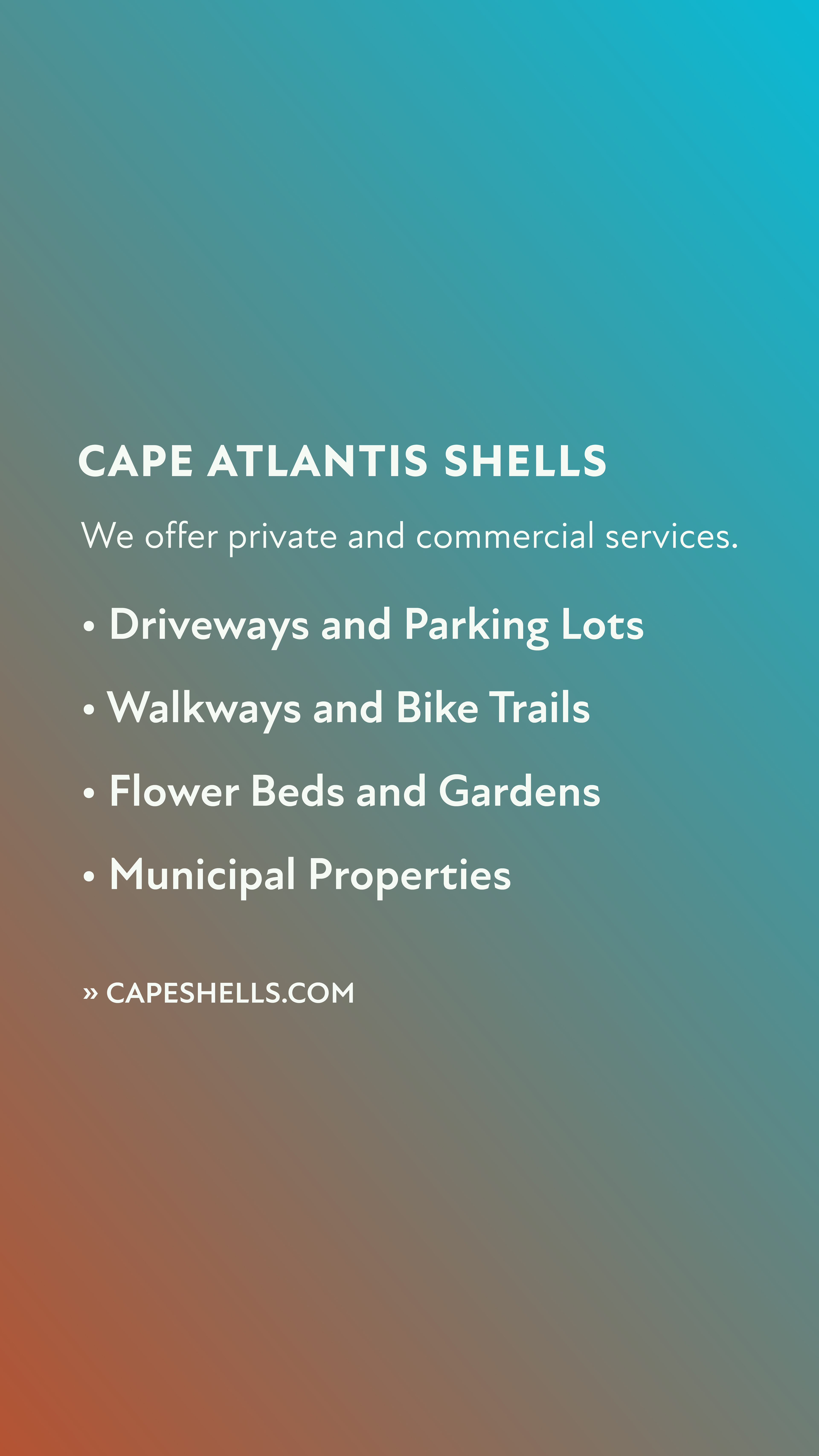

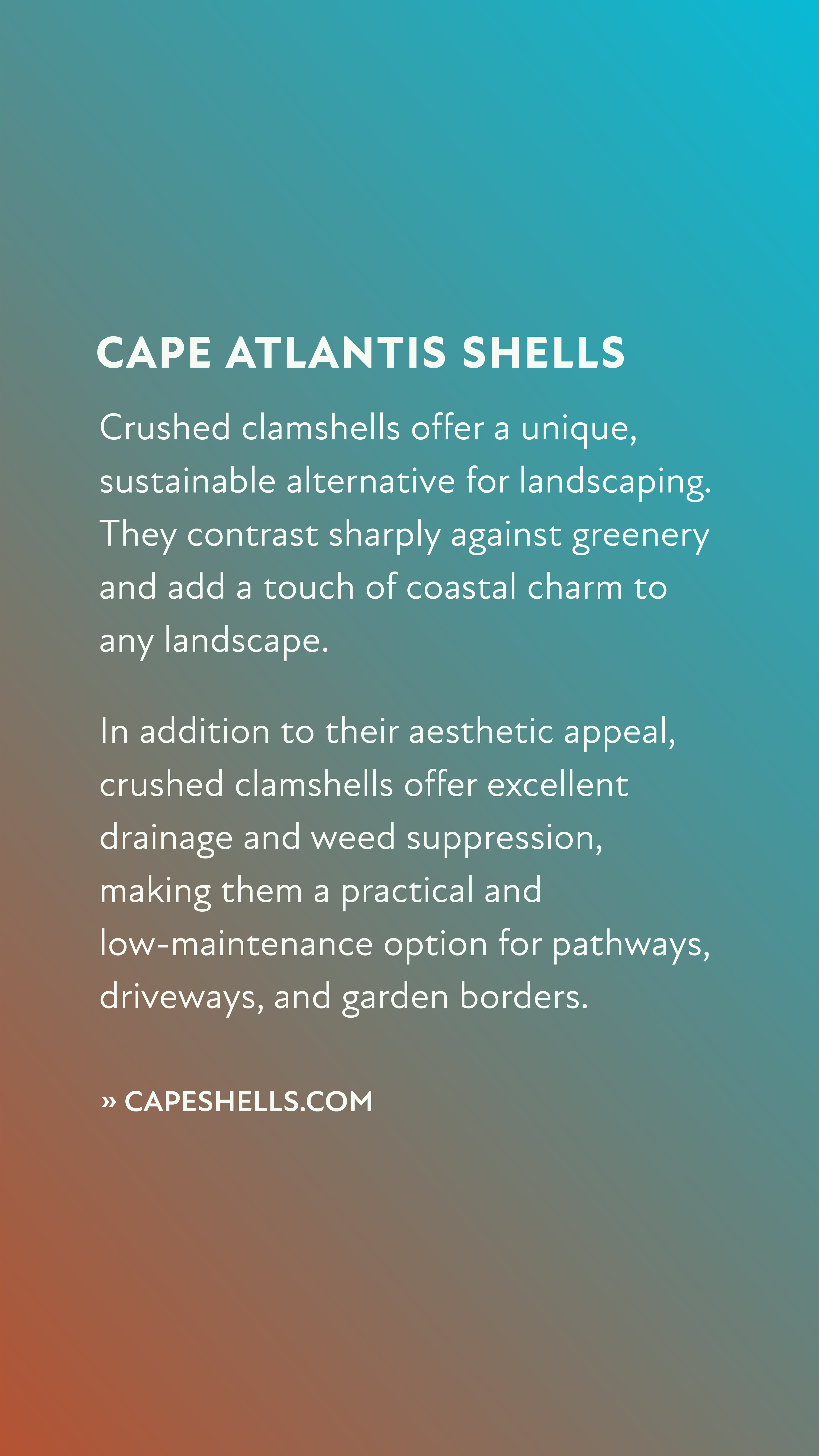
social media assets

primary color palette
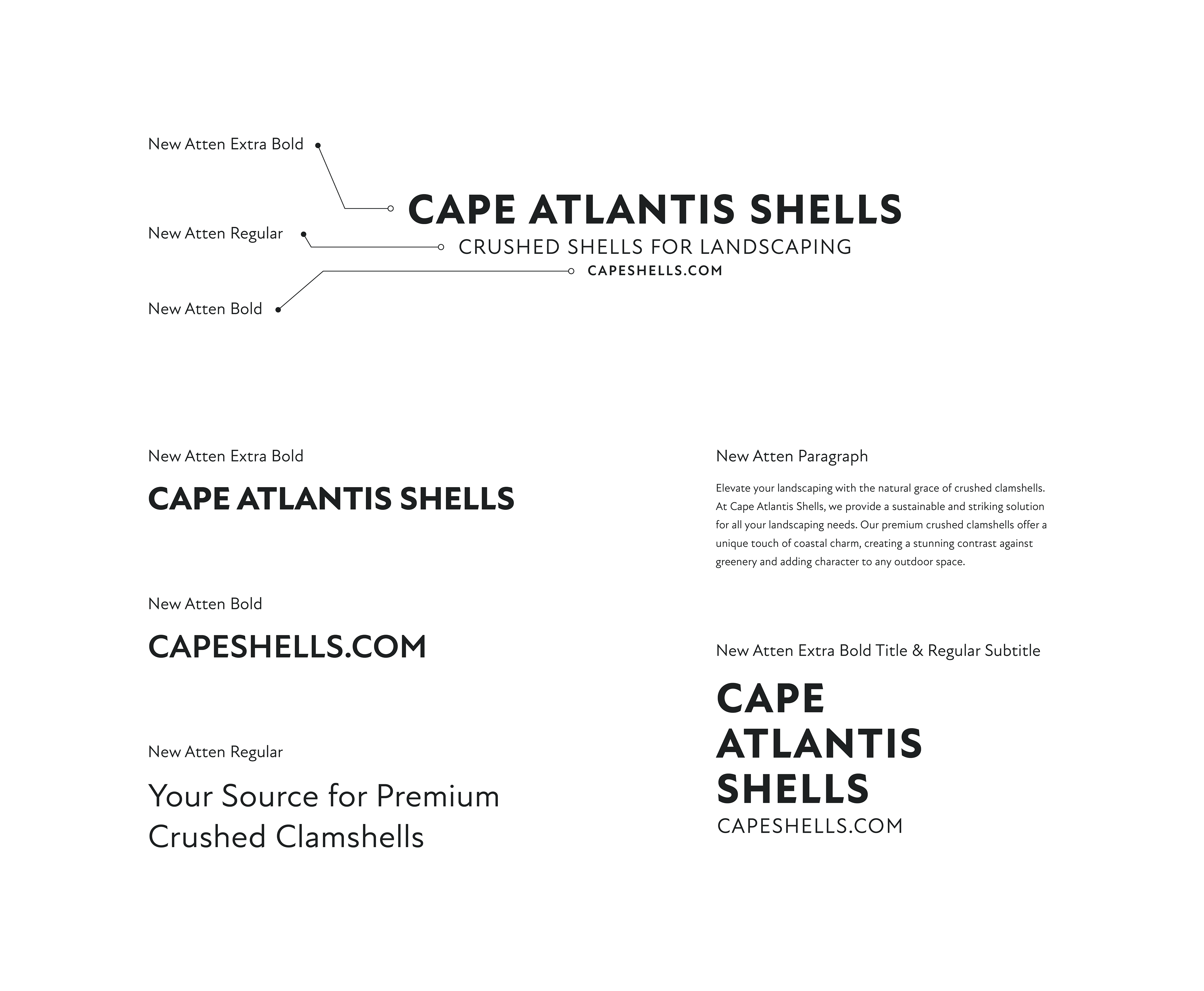
typeface