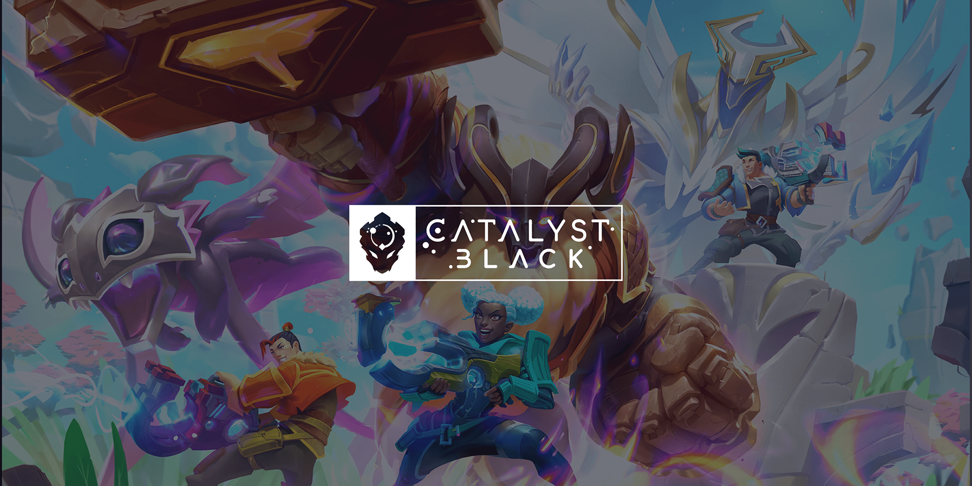
Catalyst Black – Promotional Design
Brand Designer & Graphic Designer – Super Evil Megacorp
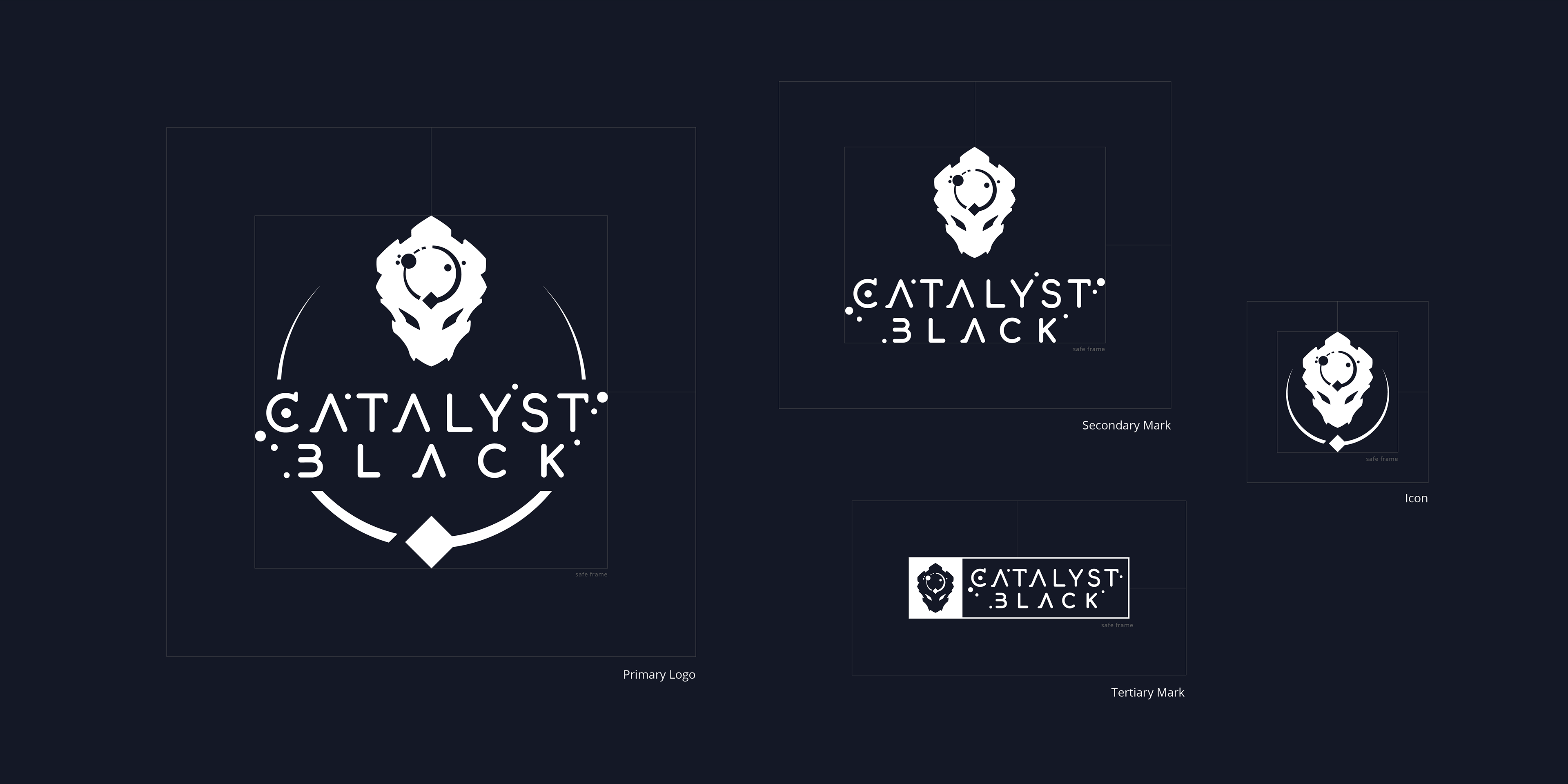
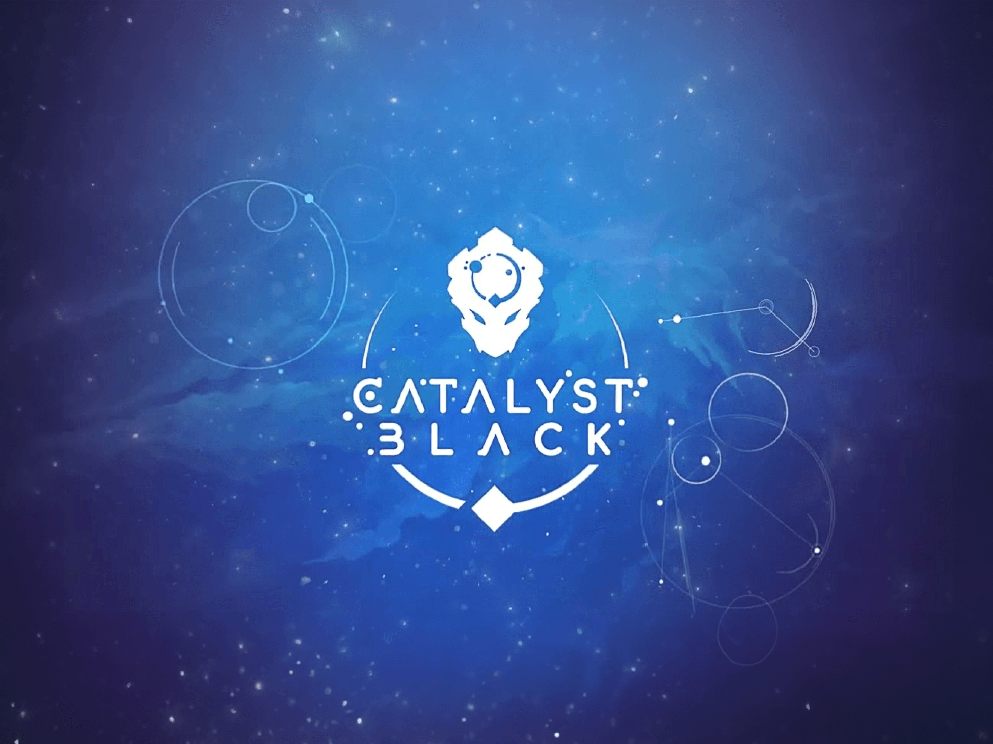
Overview
Catalyst Black is a free-to-play team-based battleground shooter from Super Evil Megacorp, built on their proprietary cross-platform engine, E.V.I.L. The game was designed to deliver console-quality visuals and controls across mobile and desktop — a significant achievement that the marketing needed to reflect.
Following my initial logo and brand identity work for Catalyst Black, I was brought back to support the launch campaign. Working closely with the Vice President of Marketing and the in-house Art Director, I developed a suite of promotional materials to consistently communicate the game's dark, high-energy aesthetic across multiple channels: character cards, app store, slides, and 1-sheets.
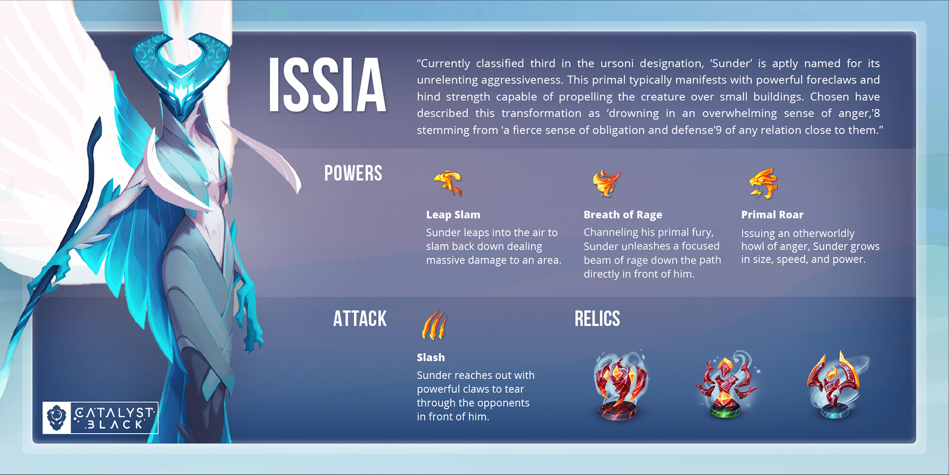
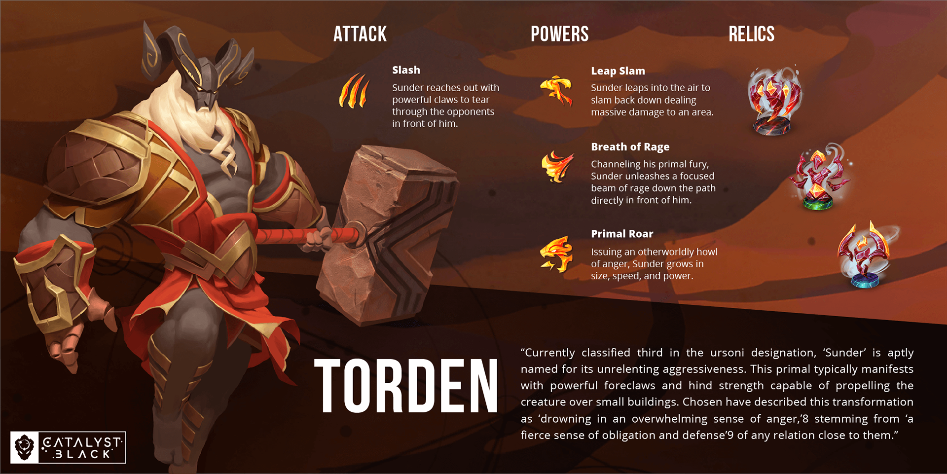
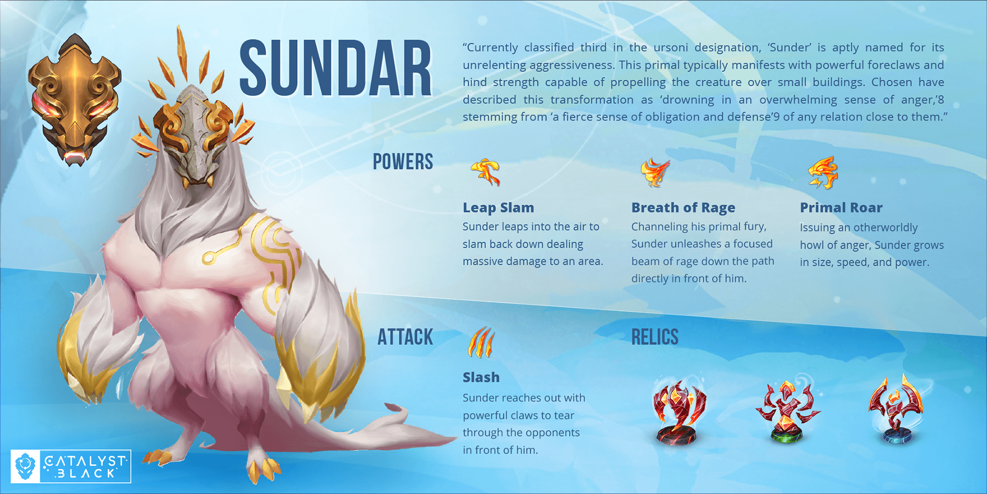
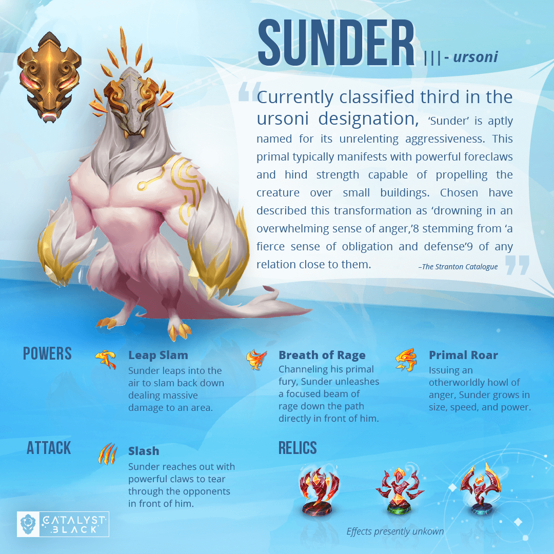
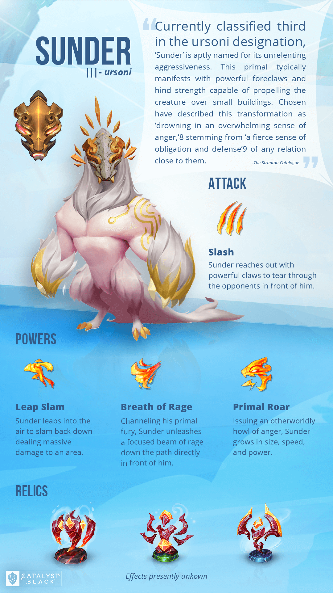
01. Character Promo Card Template
One of the first needs was a scalable system for showcasing the game's roster. Rather than designing each character one-off, I created a flexible card template that balanced dynamic character art with structured brand elements — logo placement, name lockups, and atmospheric background treatments. The template needed to work across social media crops, press kits, and in-game promotional surfaces.
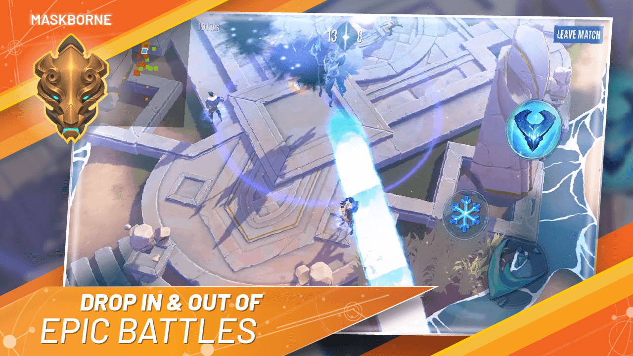
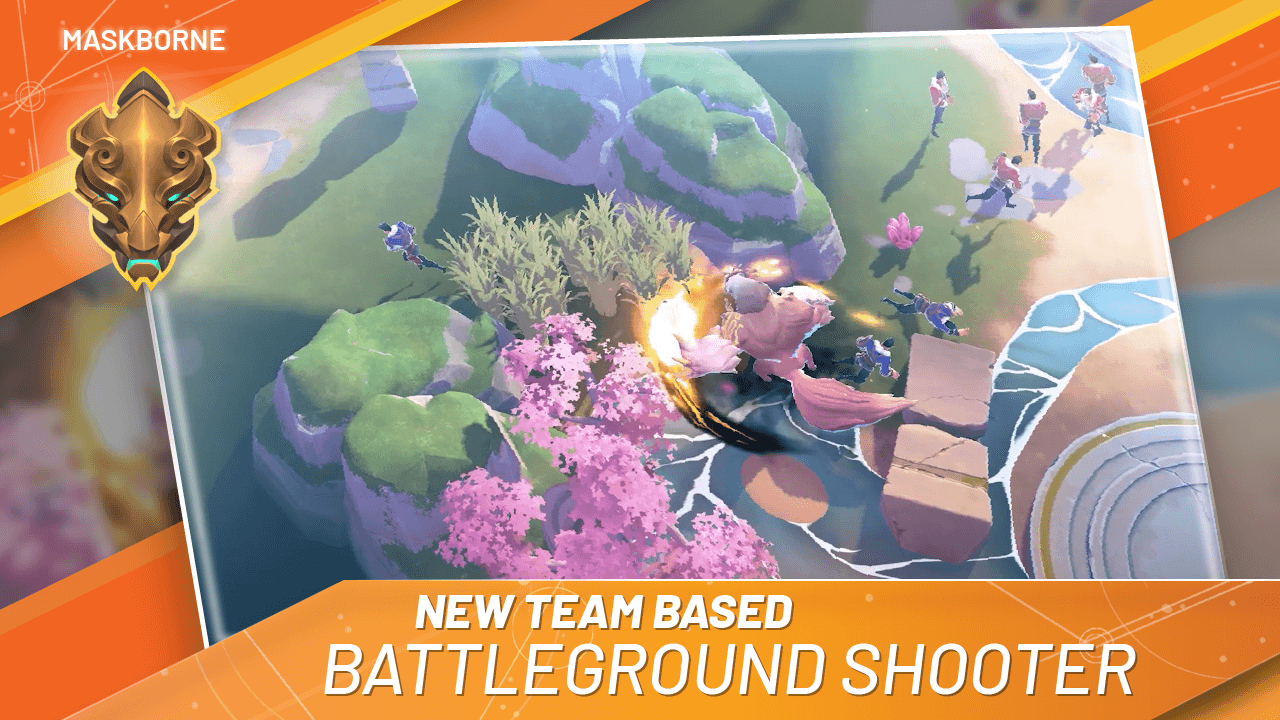
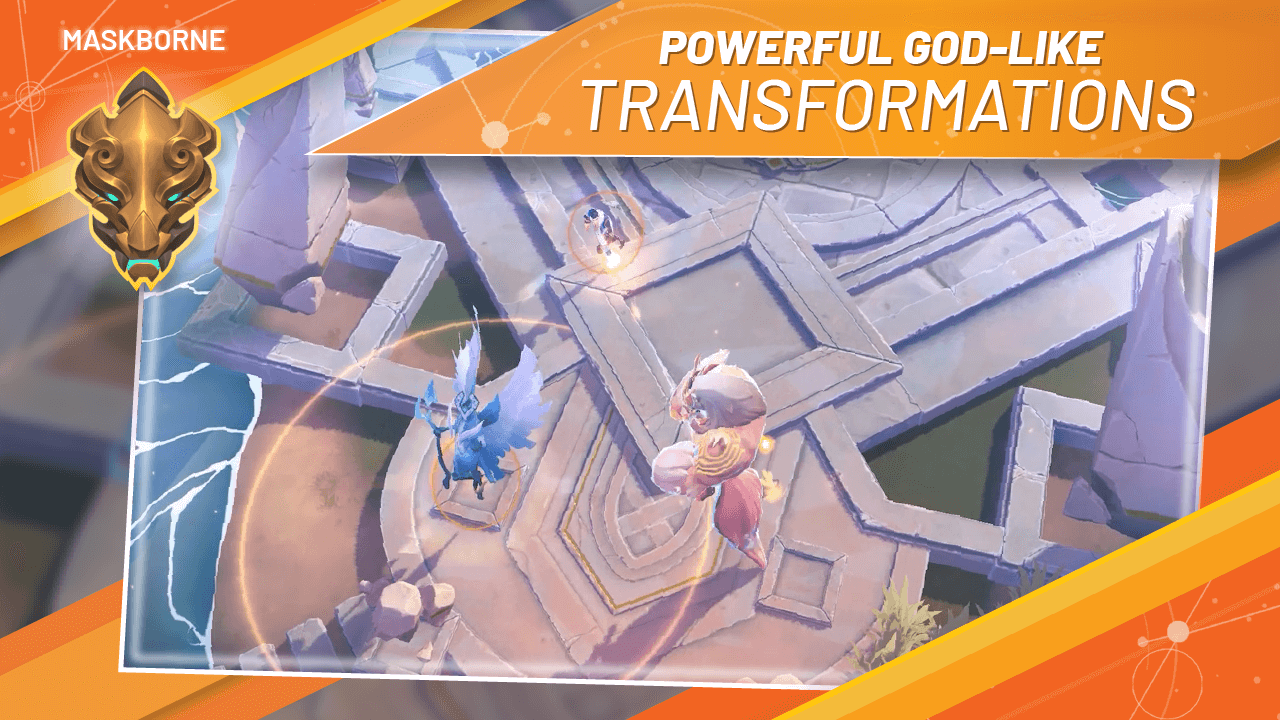
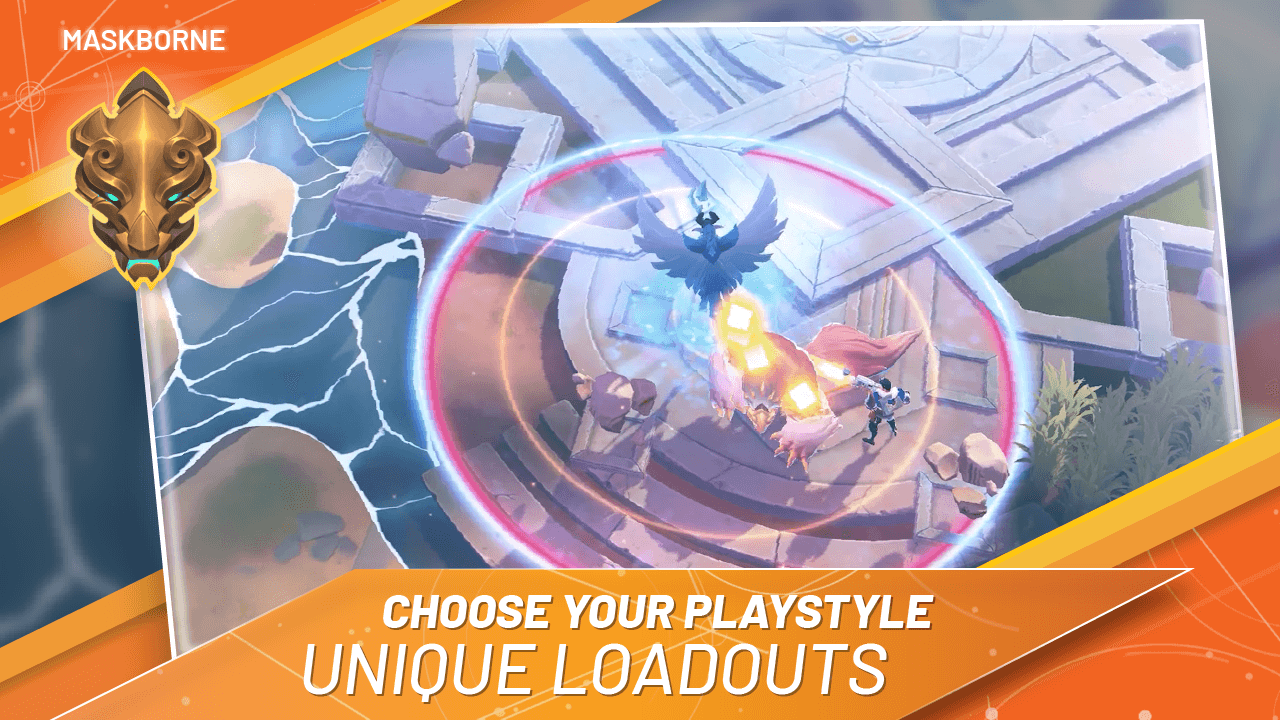
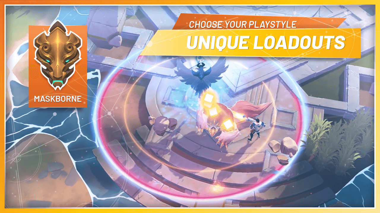
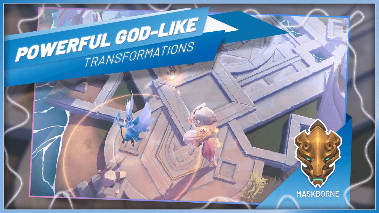
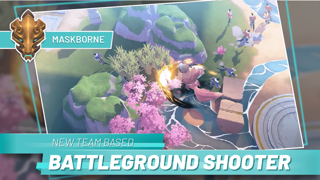
02 — App Store Slides: The Maskborne Misdirection
Before Catalyst Black's public reveal, Super Evil Megacorp ran beta testing under a code name: Maskborne. This created an unusual and genuinely interesting design challenge — I needed to create a fully realized app store presence that felt polished and intentional, while concealing the game's true identity.
The Maskborne visual identity needed to feel like a real product, not a placeholder. I developed a visual language that evoked the game's tone — dark, kinetic, mysterious — without exposing the Catalyst Black brand. This work had to operate on two levels: credible enough to attract beta testers, and distinct enough to be walked back cleanly at launch.
03 — Launch Promotional Materials
The broader promotional suite — press slides, 1-sheets, and social templates — needed to extend the brand system into formats the marketing team could use independently. Consistency was the primary design goal here: ensuring that color, typography, and compositional logic stayed coherent whether the materials were appearing in a press kit or an Instagram story.
The work reinforced a key constraint of brand system design for games: the most important job isn't the hero piece, it's building templates that hold up when someone else is using them at 11 pm before a deadline.
Takeaway
This project sharpened my understanding of designing within an existing brand system versus building one. The logo and identity work set the rules; the promotional work was about applying those rules with enough flexibility to serve diverse formats and audiences — while keeping the brand recognizable at a glance.
Play Catalyst Black